-
about.
-
blog.
-
projects.
Back to top!

view my work.
erin.
Mobile Application Design.
#1
freedom of
movement.
Social Media.
#2
insta famous.
Animation.
#3
experimental
website.
Web Design.
#4
acid mage.
Game Design.
#5
desolation diaries.
Short Film.
#6
The Blinki and Sqeeki Show.
Animation.
#7
2020 showreel.
Showreel.
#8
Luke Stephens © 2020
Erin
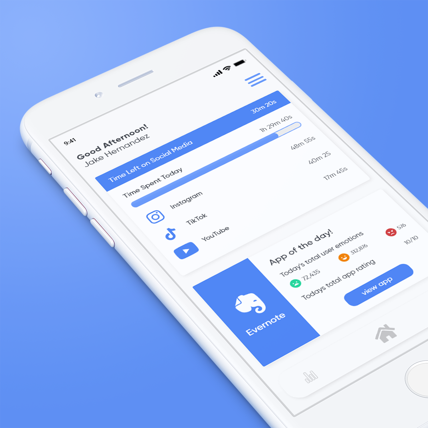
A mobile application designed for
bettering the relationship with device usage.
#UX #UI #ANIMATION
The Problem
3.5 billion humans use cell phones which amounts to 45% of the world population. The average person that falls into the 45% checks their phone 30 times a week and spends just over an hour on social media a day, This statistic is linked with a 2.7% more likely hood of mental health issues.
The Brief
Conceptualise and design a universal accessible app for your chosen brand and problem.
The Solution
It is a cumulative role of application Developers and User Experience engineers to solve this problem in a human cantered way, The problem needs to be addressed in a way that is positive reinforcing and retains users to keep screen time down. The Proposed solution is to create a cell phone application that tracks users app screen time along with their emotional triggers via facial recognition and HRV scanning. This will allow for notifications to be pushed to the user about their emotional triggers for the duration of application use. The app will address the issues linked to phone use and mental health issues in the current and the future with invaluable data about how user's applications make them feel.
The Intended Audience
mobile app users
app personas
App personas are important to the app creation process as it helps define the user journey and flow.


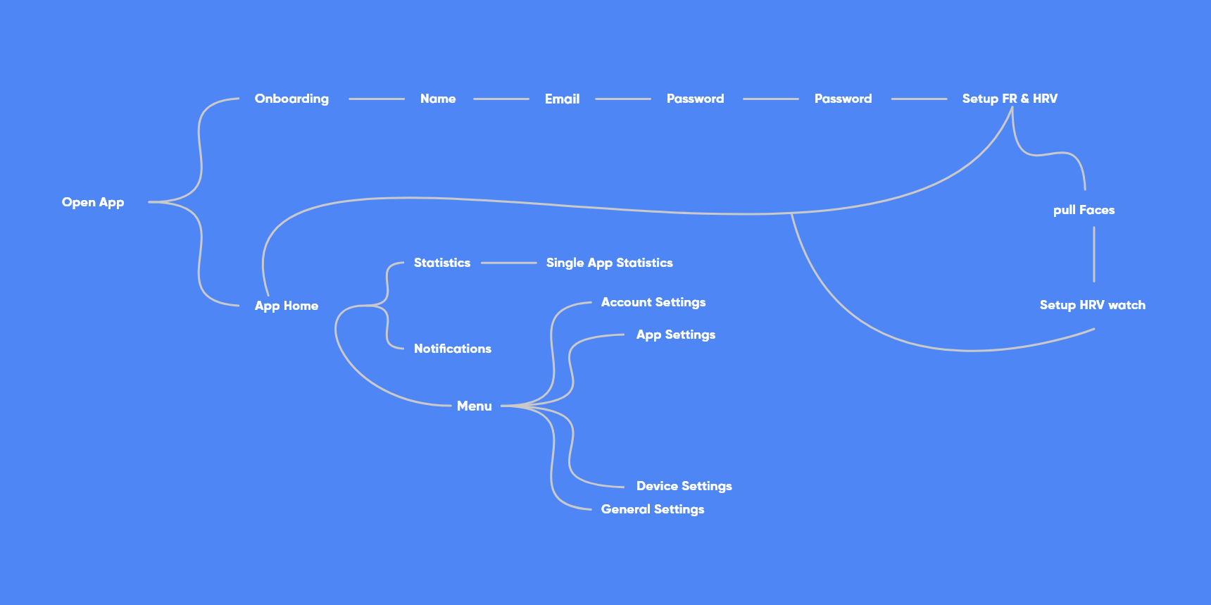
user flow
Understanding the user flow allows for faster generation of UI and UX elements as the navigation of the app is already defined.
on boarding
Familiarise the user with the objectives of the app in an informative and easy to digest manner.
Slow down
Slowing down the on boarding process allows for users to be less bombarded by information.
Using imagery
Imagery used as a mode of explanation allows for difficult concepts to be digested in a manner that is friendly and rememberable.
scanning setup
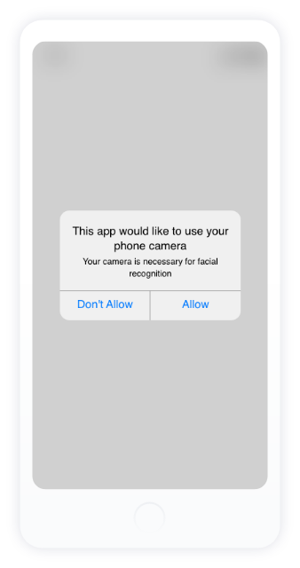
Ask the user to connect their camera and health device to the app in order to collect sufficient information.
Inform
Inform the user on how their personal data will be used.
Specifically important for features that a user may feel privacy concerns towards.
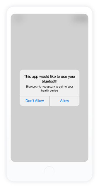
Visually communicate
Users may not know what a 'health device' is, using visuals to support this word makes the connection for the user.
sign up
Collect the user information that is necessary to assign the user to the database.
Breakage
By breaking apart the account creation or sign up inputs, the user is void of having to make a decision. One input box allows for one answer.
app home screen
This is the screen the user will load into either after login or sign up.
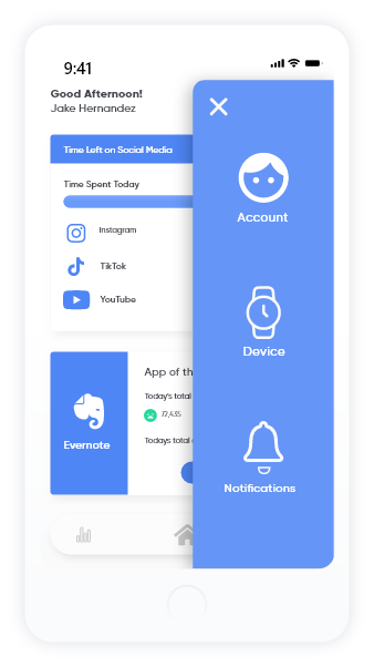
The user can access the most necessary pages by swiping left or right or using the navigation bar at the bottom.
additional settings can be accessed by the hamburger menu in the top right.


statistics screen
Users will be able to see all their app activity within this screen.
app statistics are split into groups under 3 periodic terms:
daily, weekly and monthly.
This allows users to keep track of their app use while being able to see if they have made the progress they want.
notifications screen
The notifications screens allows users to see what up-coming notifications they have while showing users the time remaining they have left on their app and app groups.
These notifications can be set via the notifications tab in the ham burger menu.
account settings
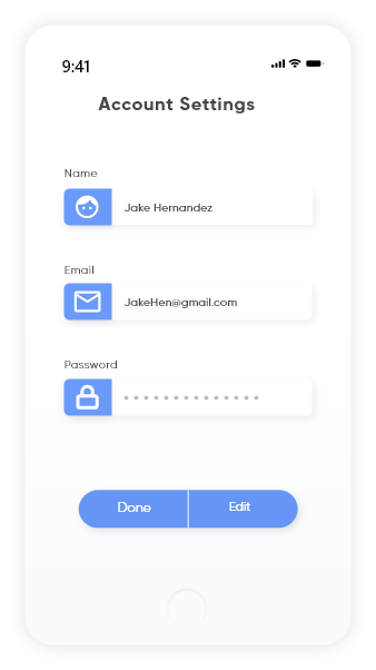
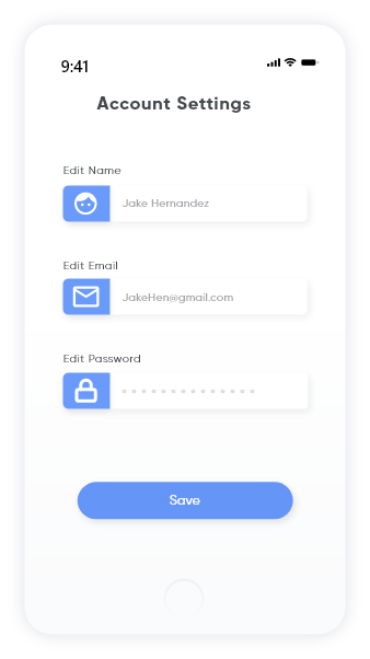
Allow the user to edit their account settings.
Account
Allow users to edit their personal information such as:
account name, email address and password.
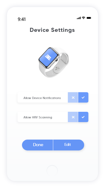
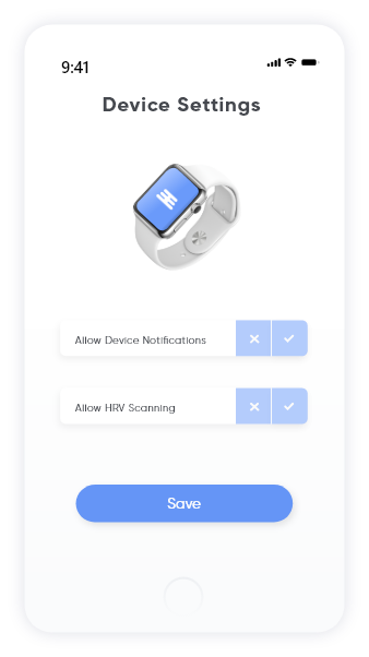
device settings
Allow the user to choose their health device preferences.
Device
Allow the user to toggle HRV scanning and device notifications.

notifications settings
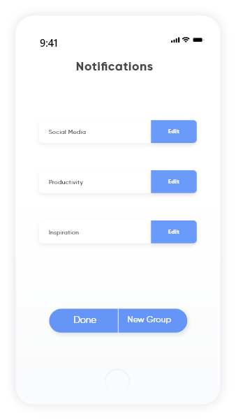
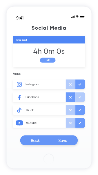
Allow the user to create their specified notifications.
Notifications
The user is able to create specific notifications for apps as well as having the ability to create notifications for entire app groups.

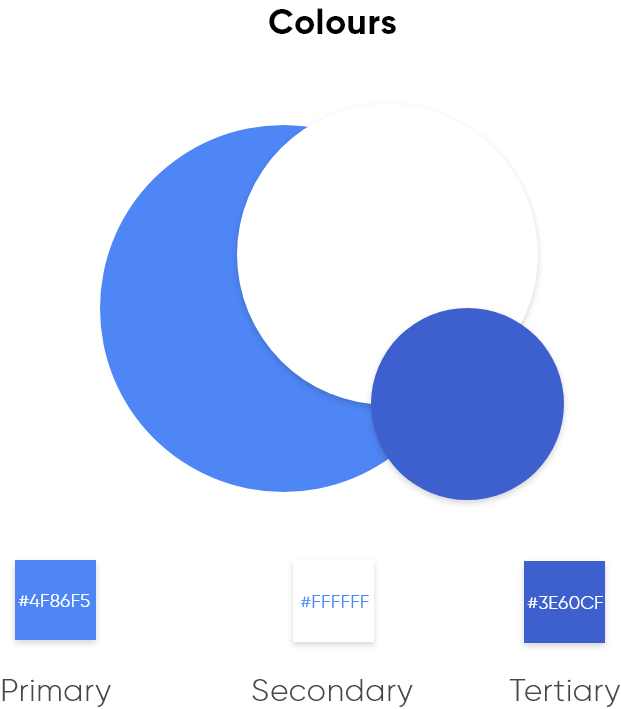
style guide
Allow the user to edit their account settings.
Case Study
Watch the case study of the mobile application Erin to learn more about the application and how it works.


Freedom of Movement
A social media campaign for Freedom of Movement.
#SOCIALMEDIA #CAMPAIGN #ANIMATION
The Problem
Freedom of Movement would like to stregnthen their online presence through video and motion graphic content for their products and lifestyle.
The Brief
Design and produce a complete digital social media campaign.
The Solution
Create a social media campaign that promotes products from Freedom of Movement.
Using the concept of Freedom of Movement as the the main core of the animation and aesthetic style.
The Intended Audience
Young adult consumers.
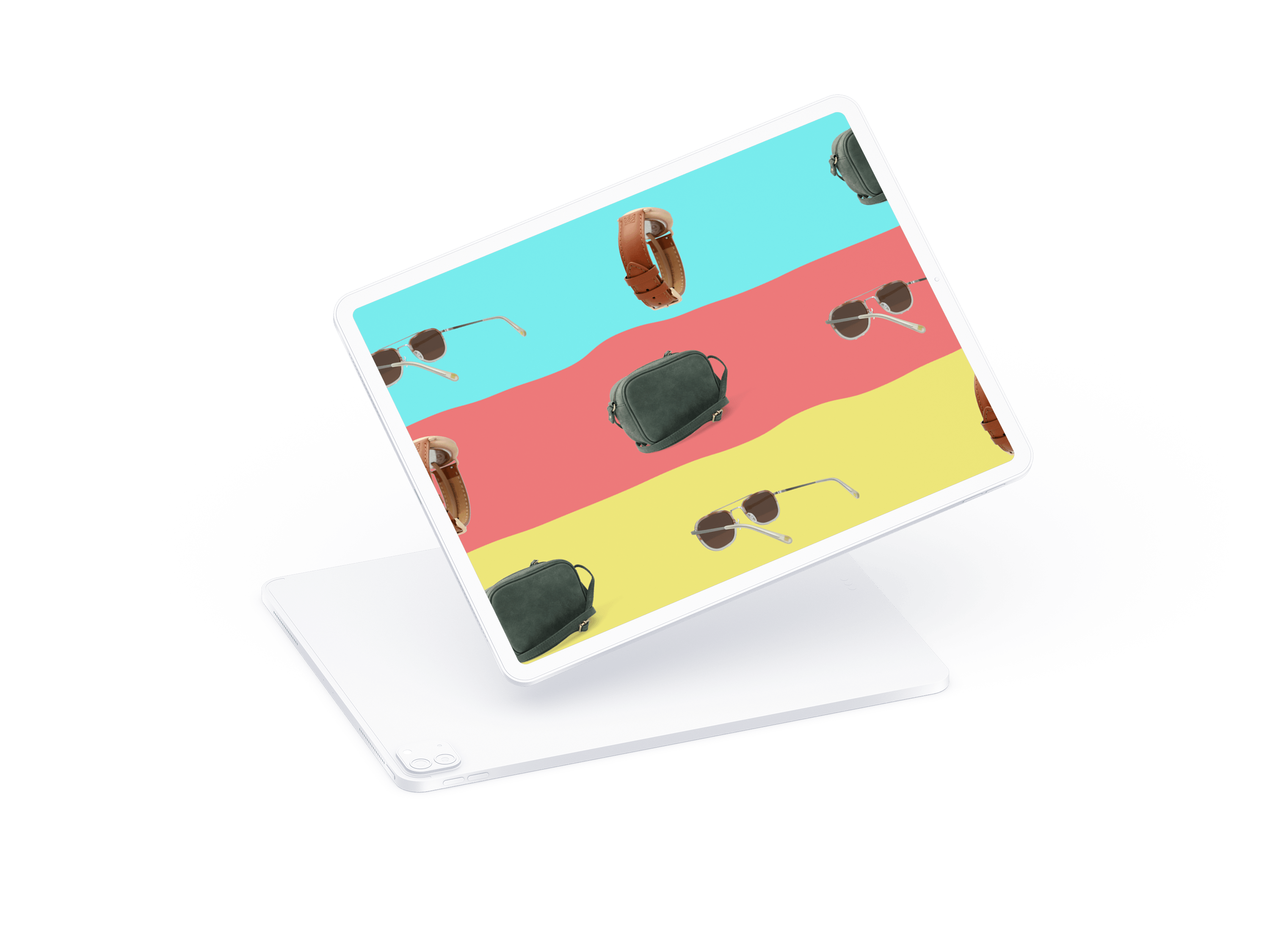
Freedom of movement Facebook banner and post mockup.
Elements are taken from the overall branding design and correctly resized for Facebook.

Freedom of Movement Instagram story videos.
These videos where created to expose the Freedom of Movement products.


This pinterest banner video is specific to the search results for leather bags.
The animation will play along side related product searches in an attempt to entice the consumer.

TikTok
Following the same branding langauge the TikTok platform offers expose for Freedom of Movement to the younger consumer base.


Example of a Freedom of Movement Twitter ad post.

Google Ad
Once again another banner add specific to google ad word searches.

Youtube Ad
Freedom of Movement Youtube AD placement mockup videos.
These AD will play on family friendly content that is search related.
Case study
View the Freedom of Movement branding case study to see all the content in action.
Insta Famous
Personal logo branding animation.
#SOCIALMEDIA #BRANDING #ANIMATION
The Problem
As designer it is important to have a visual brand identity that separates your from other designers, Create a unique logo animation for your brand.
The Brief
Identify conceptualise, develop and execute a logo and design elements/iconography as part of a self-promotional brand identity.
The Solution
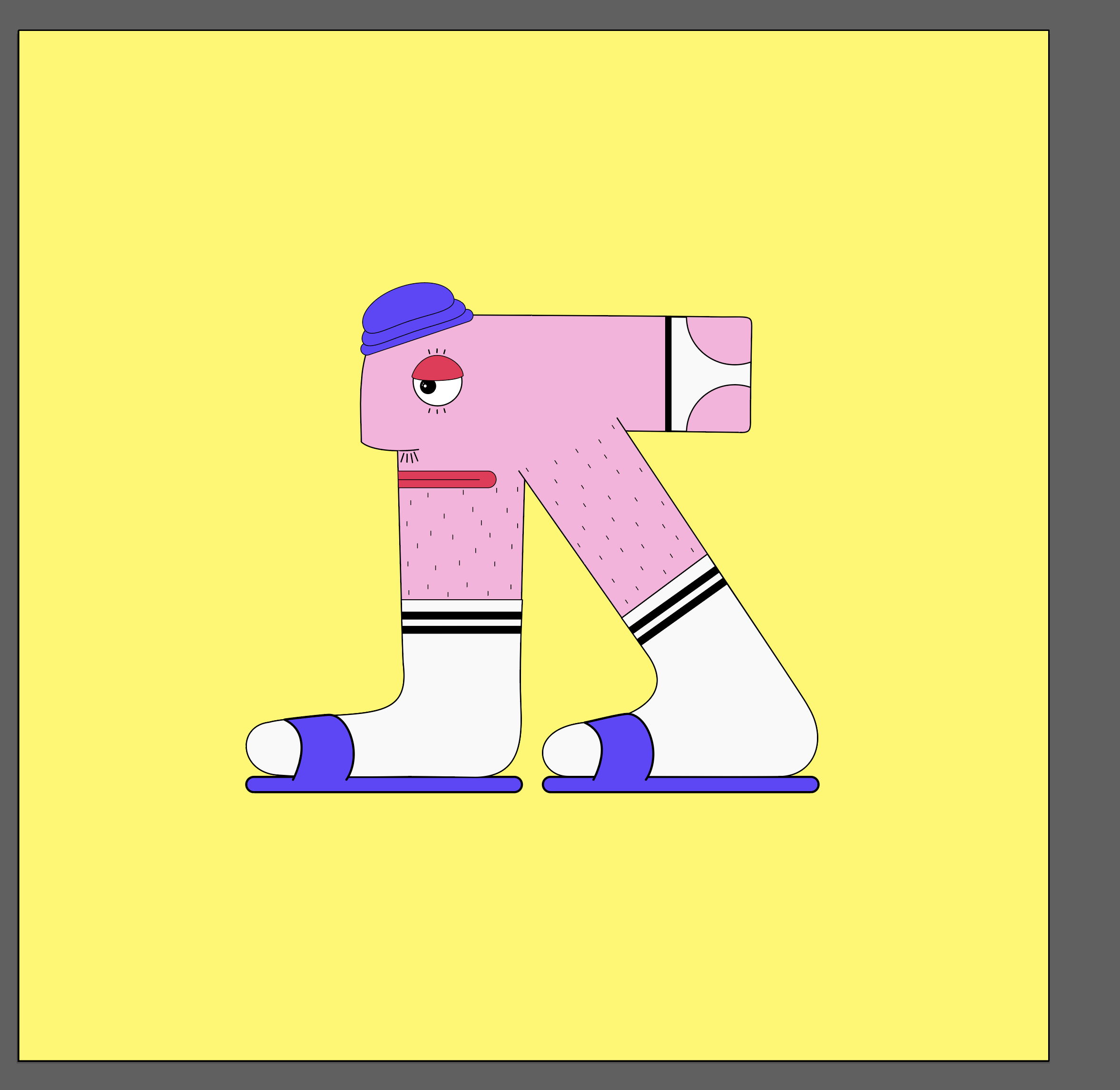
The solution was to create a quirky animation that represents me as a person and a designer.
The logo is in the formation of an L and a S which represent my initials in my name.
From which a quirky character was created that represents my identity as a person and personality.
The Intended Audience
All respective ages and those that will be viewing my creative content.
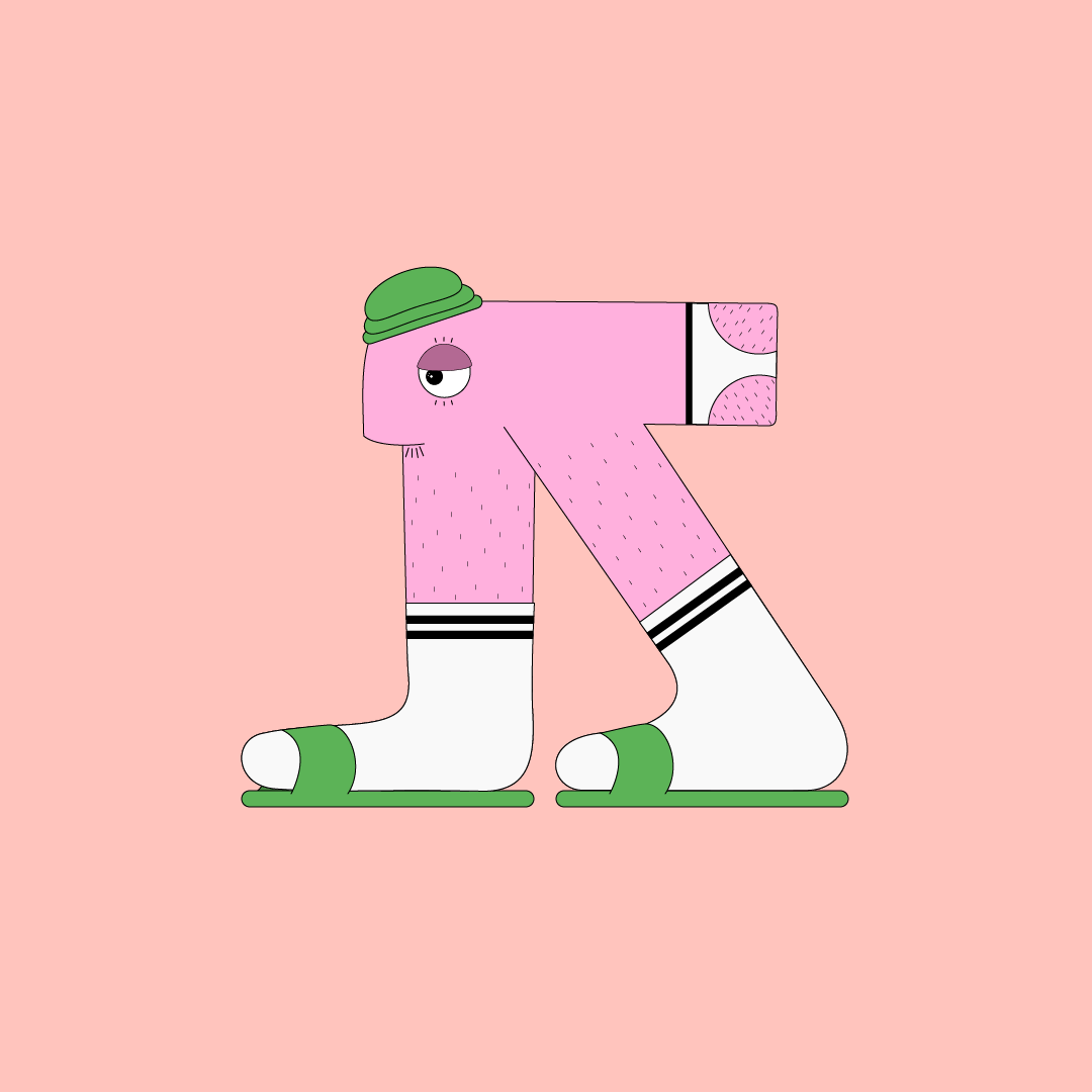
Idea Generation
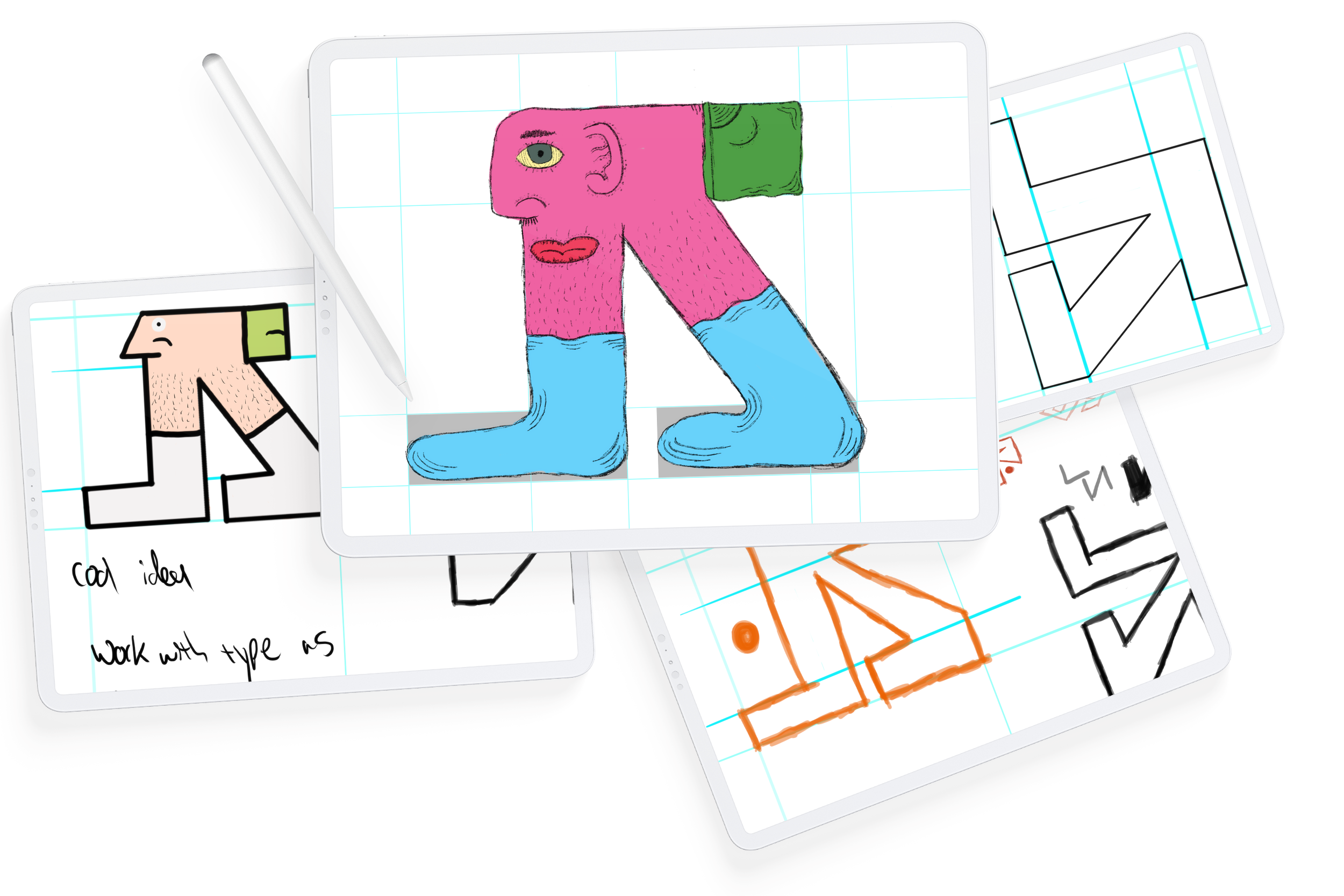
The idea for the logo design was drawn out on an Ipad.
The first conceptual design started off based on the initials of my name L & S.
Therefore it took shape into a character that was sketched out.
Elimination
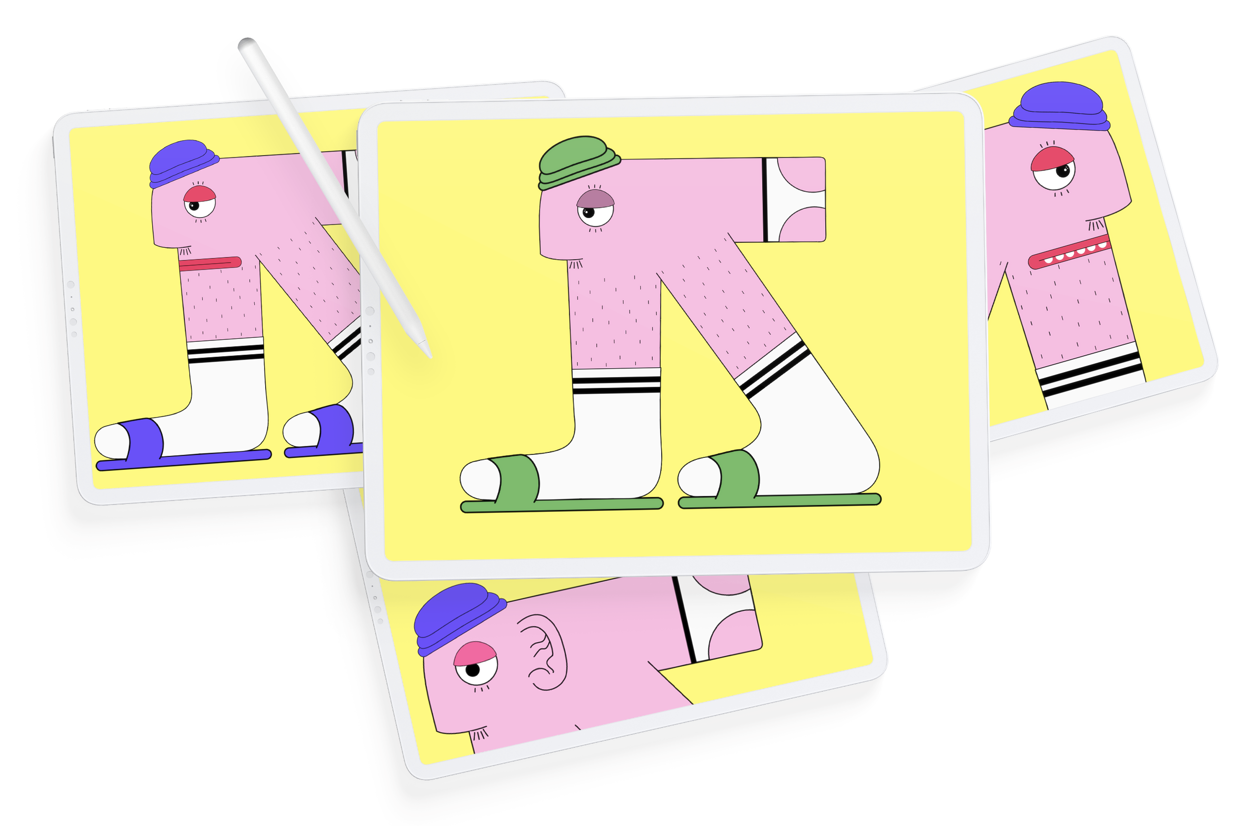
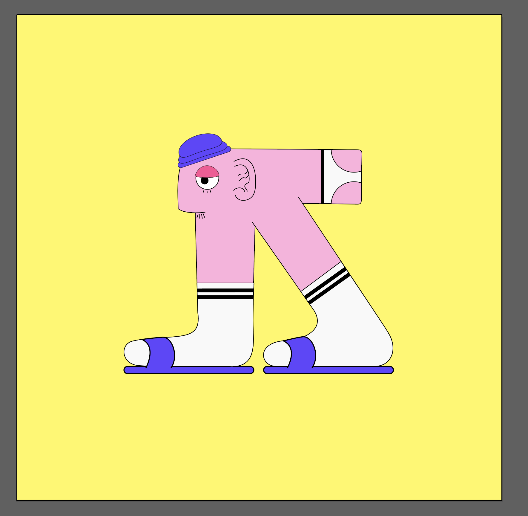
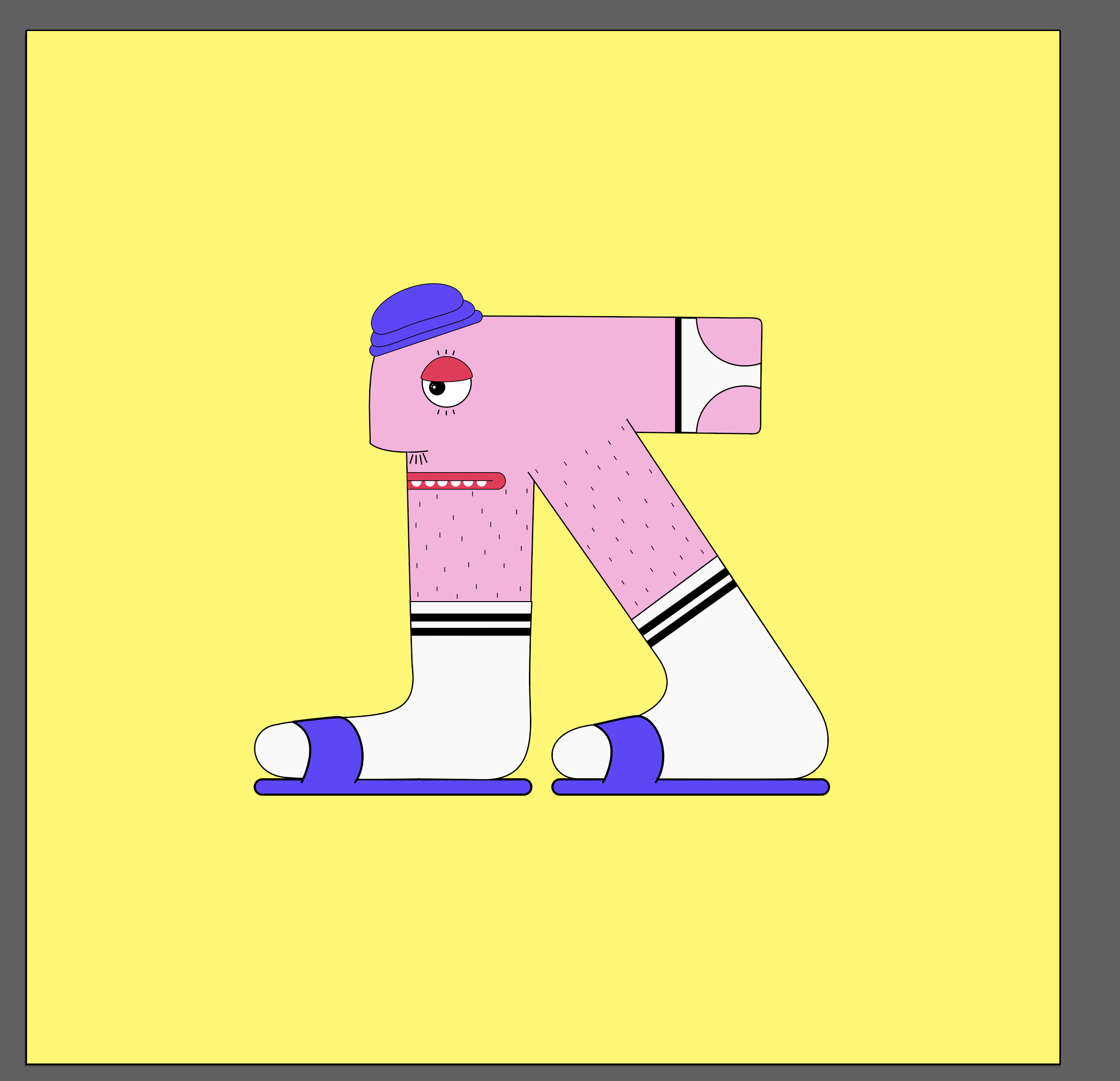
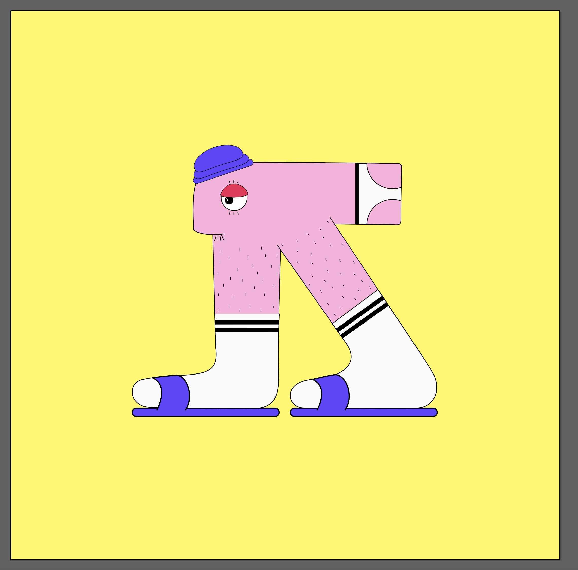
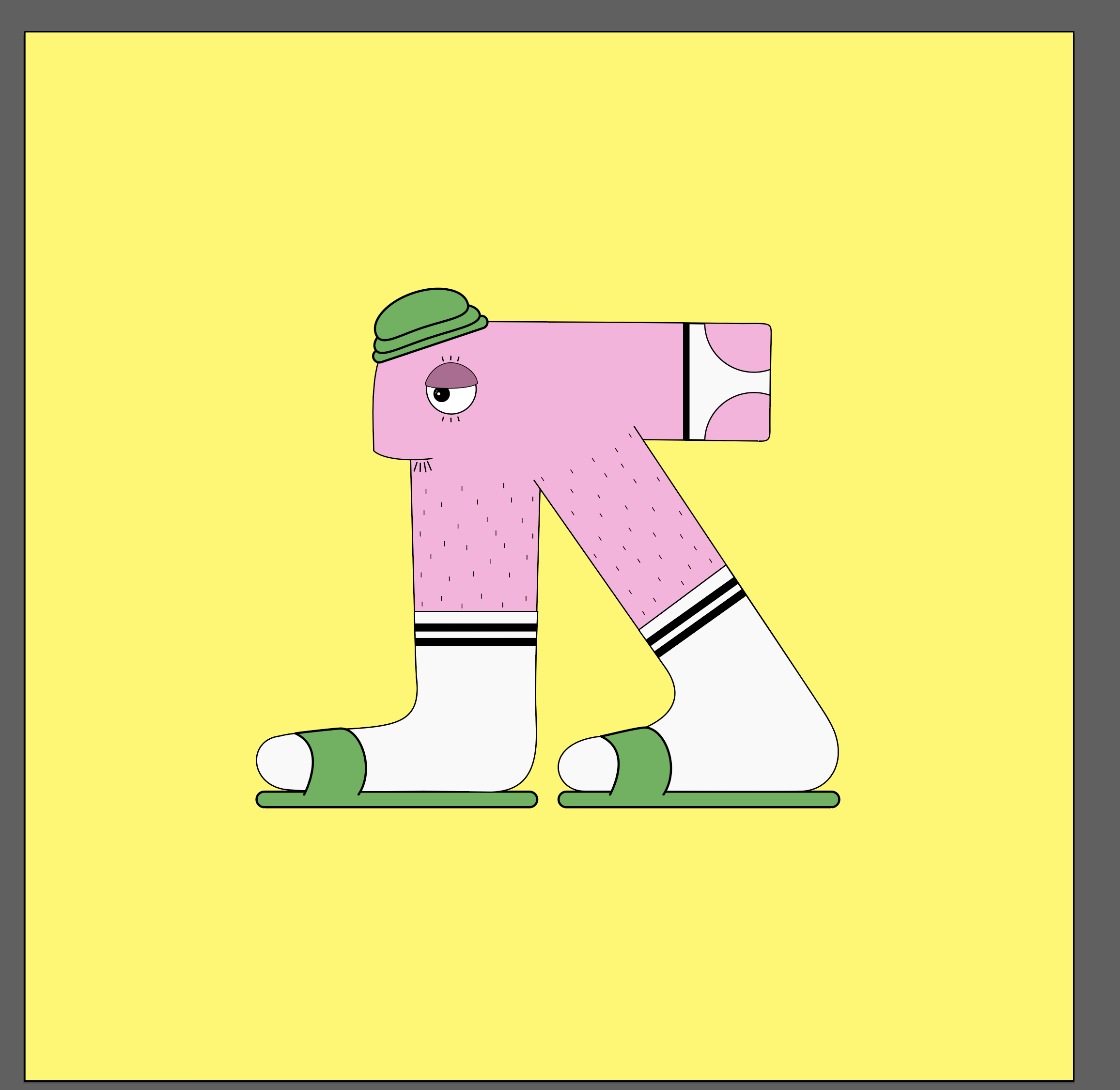
Process of elimination began once the character had been cleaned up in illustrator.
Different aspects of the character where added and remove to make the final design.
Sound design
Sounds were created with the use of abstract objects to create supporting sounds.
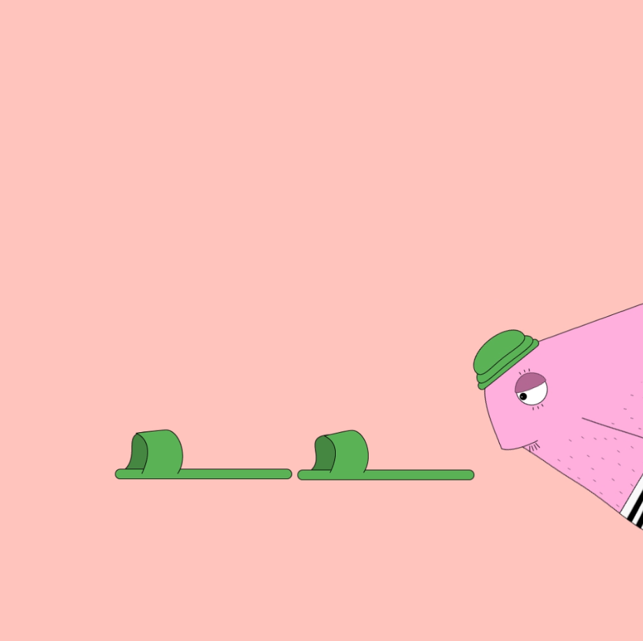
Animation shots
In between animation shots for planning the final movement of the character.
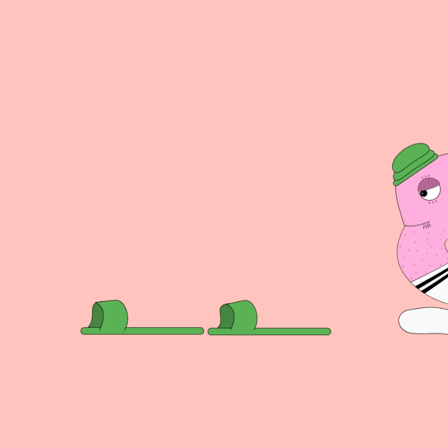
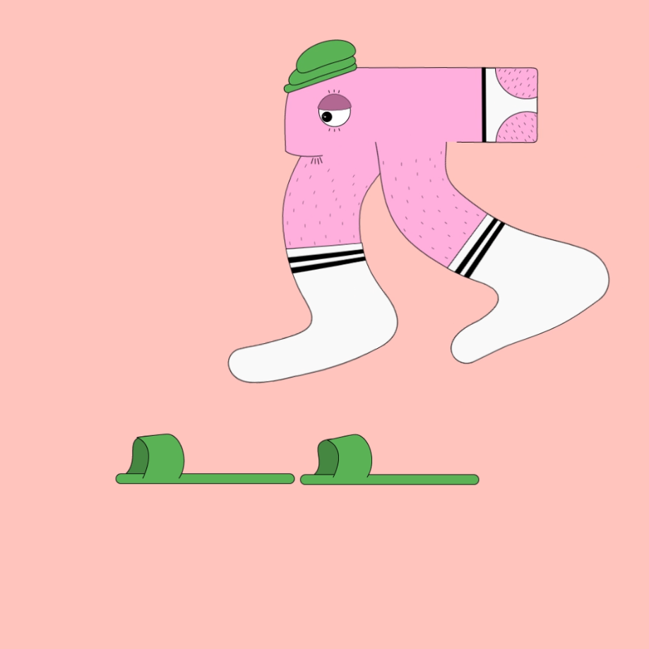
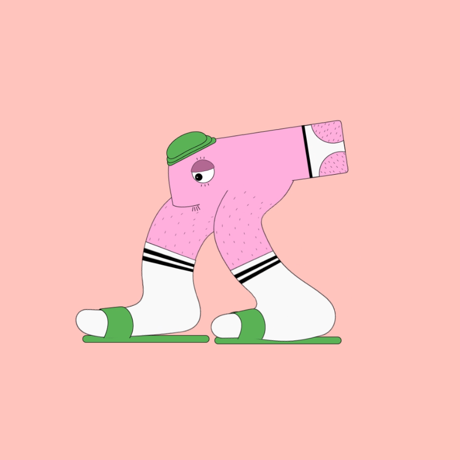
Final product
The final animation includes music and supporting sounds to create a fluid animation.
Experimental Website
An experimental website focusing on the notion of numbers.
#WEB-DESIGN #CODING #ANIMATION
The Problem
Find a way to present an interesting concept about numbers to the target audience.
The Brief
Use this brief to change the way you think about numbers and fire your audience’s imagination to see the world with fresh eyes. Research and investigate the philosophical and factual elements of numbers and create an engaging experience for your target audience. Work to develop ideas that are not obvious and shine a new light on how numbers intertwine with our lives and give narratives to our experiences, both culturally and theoretically.
The Solution
The solution was to make an introspective website about how numbers make me feel as a creative.
The reason being as a creative that I have always felt working with numbers to be uncomfortable and the solution was to find a was to represent this feeling in a creative and accessible manner.
The Intended Audience
Designed for an audience to be taken on a journey through my mind and it's connection towards feelings and numbers.
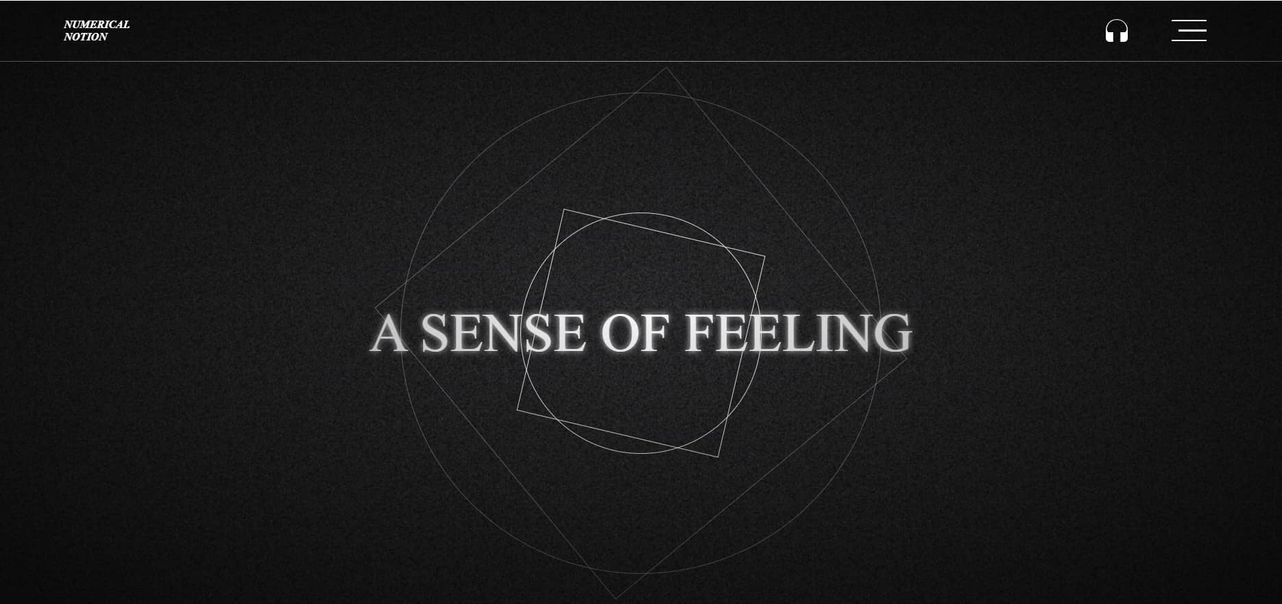
Case Study
The case study gives a prerecorded experiance of the website along with a narrated explanation.
Home Page
The home page begins with a repetitive animation and sound to set the mood for the website experience.
Menu
The menu opens and expands the option to select a chapter.
About
The about page gives a brief overview of the experience the user will go through.
Positive Singularity
This section represents the positive effect of a singularity within a black hole.
Stability of Straightness
This section is representative of the artists connecting to numbers and how that view is opposed to others.
Devine Representation
This section is linked to the numerical value of 100.
Repetivity of Infinity
The repition within this section is relative to the fuild motion that is encapsulated within the numerical value 8.
Entirety of Everything.
This section visually represents gravity in terms of the effects and feeling.
LAUNCH THE WEBSITE
*large file size*
Acid Mage
An indie plat-former game.
#GAME-DESIGN #ANIMATION #CODING
The Problem
There is a need for new and exciting narratives within the gaming world as large corporations often follow the narrative that is most lucrative.
As an indie developer create a functional 2D platformer game that is supported on a strong narrative and that is enjoyable to play.
The Brief
Produce a new 2D platformer game franchise with new game goals and game objectives; which is based on traditional principles of a 2D platformer game.
Create a custom Hero design for the game including all the required animations for movement.
Create custom enemies, collectables, puzzles and environments to complete one playable narrative.
Create all the UI elements which include: Title Design, Launch Screen, Menu Screen and a Heads up Display.
The Solution
Acid Mage follows the journey of a young girl who has fallen into a bad acid trip.
Her inner most emotions now become the game of life as she is tasked to fight her inner demons and ascend from the hell she is stuck in.
The Intended Audience
The game feel is best suited towards controller input and the game mechanics would be adoptable by consumers of all ages while the narrative is targeted towards a teen and up consumer.
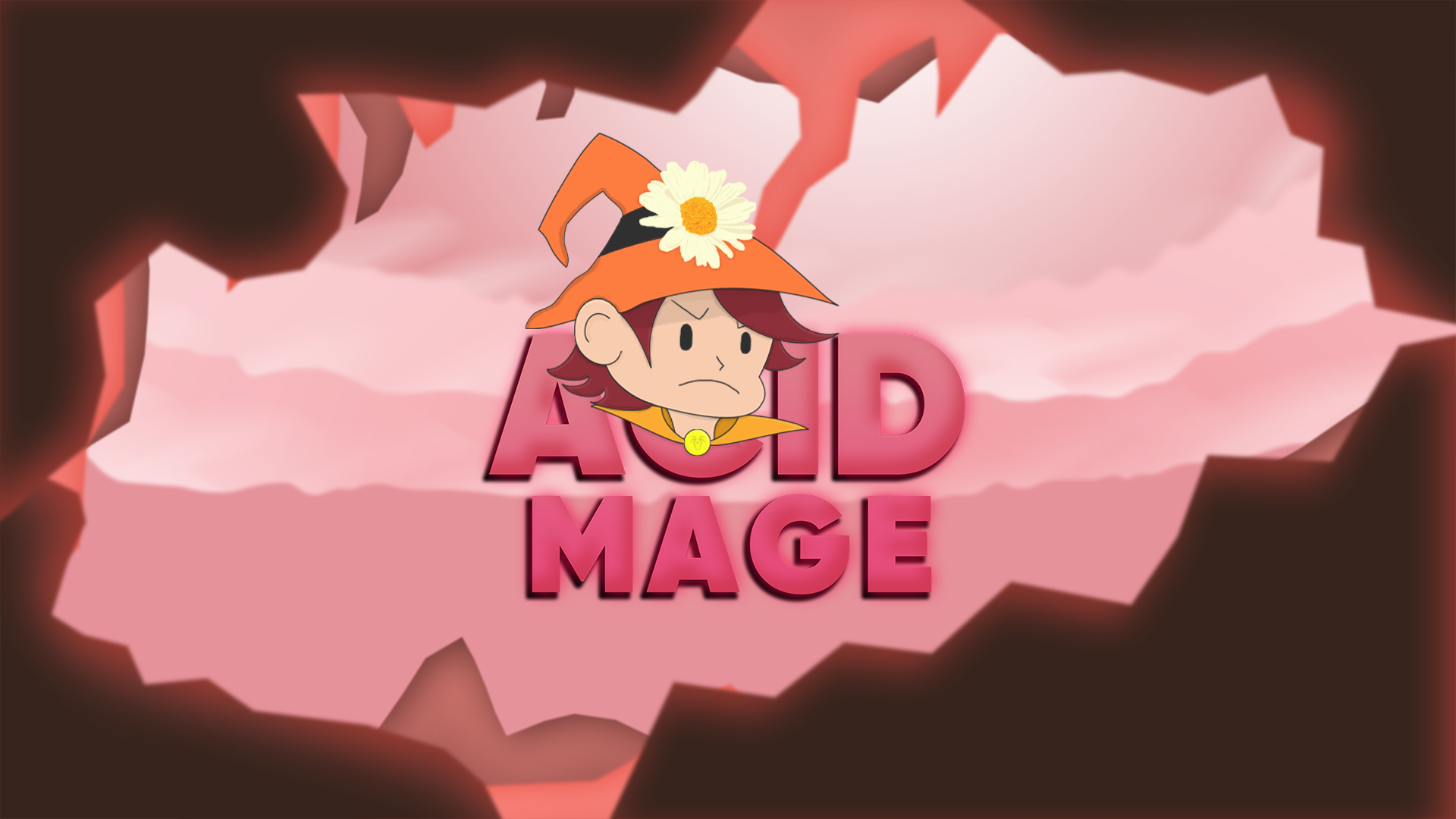
The Premise
Acid Mage is based around a young girl who is stuck in the dark depths of an acid trip.
Her subconscious has recreated her inner being as a mage. She now exists as a powerful character with abilities to help her fight the darkness…
Hope is lost, Will she ascend out of the dark depths?
The character is transported into a level based platformer where mental dexterity and skills are required.
The character is required to use her new found abilities; to fight off darkness demons and leap from platforms with the hope of existing the grasp of darkness.
Background elements
The background elements were drawn in Photoshop at a 3-6k resolution and layered in unity on the z-index to create a parallax effect.
#background-layers
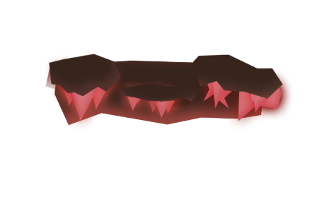
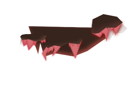
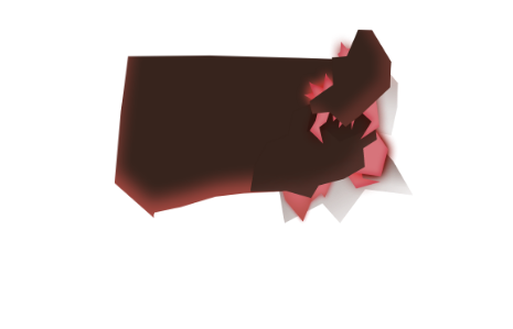
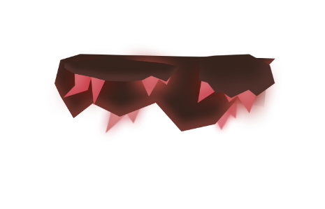
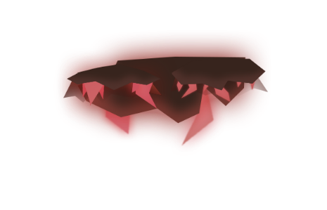
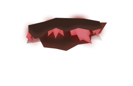
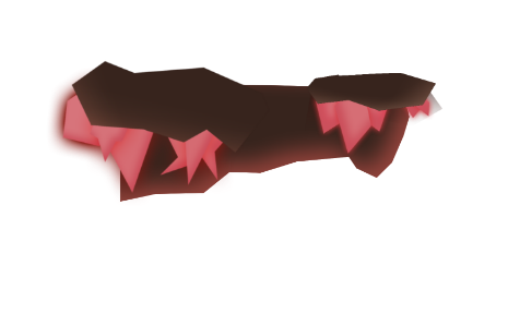
Platform elements
Platform elements were drawn in Photoshop and are layered in unity.
#platform-1
#platform-2
#platform-3
#platform-4
#platform-5
#platform-6
#platform-7
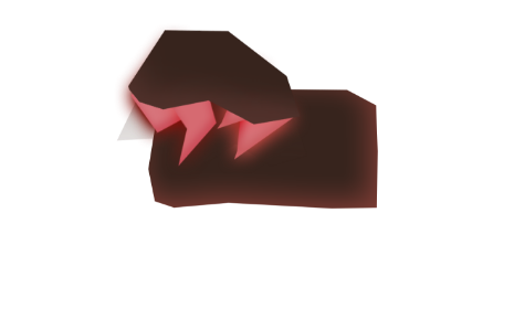
#platform-8
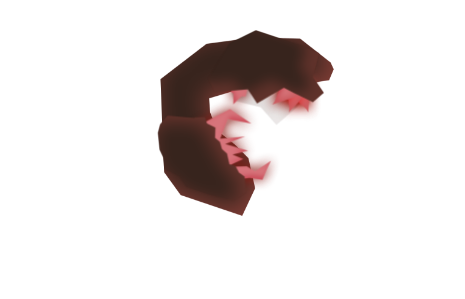
#platform-9
Platform Post-processing effects
Once the platforms are put into unity they are effected with lighting and particle effects.
#platform-1
#platform-2
#platform-3
#platform-4
#platform-5
#platform-6
Level Design
Level design was drawn out in Photoshop from a large perspective and rescaled in unity in the correct layout.
#level-1-large
#level-1-close
#level-2-large
#level-2-close
Initial Character Design
The initial characters were drawn and planned in Photoshop.

#character-outline-1

#character-outline-2
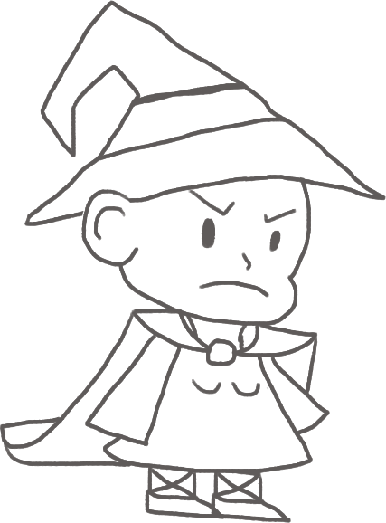
#character-outline-3

#character-outline-4
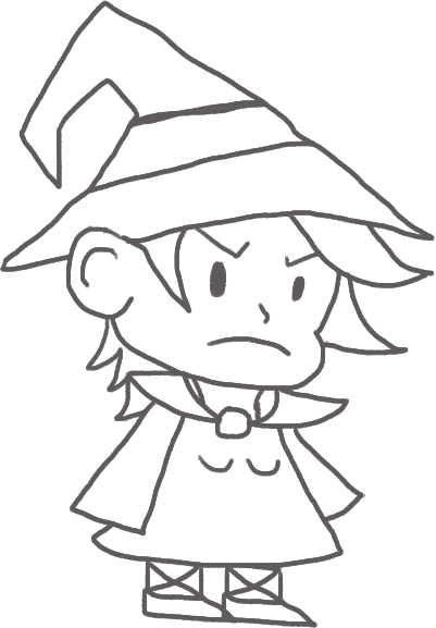
#character-outline-5
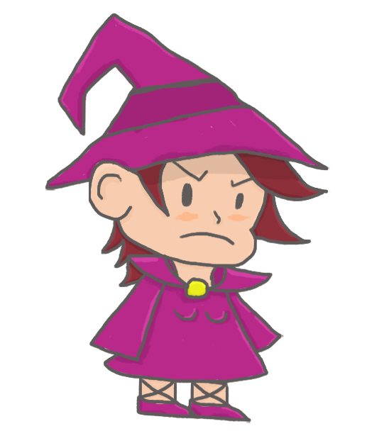
#character-colour-1
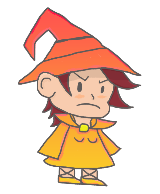
#character-gradient-1
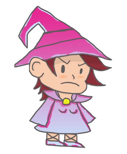
#character-gradient-2
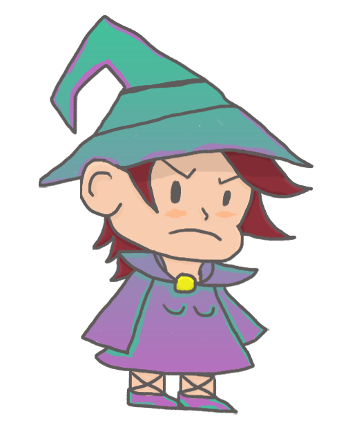
#character-gradient-3
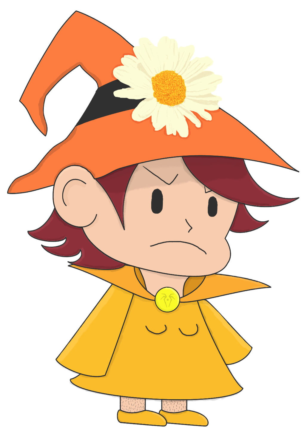
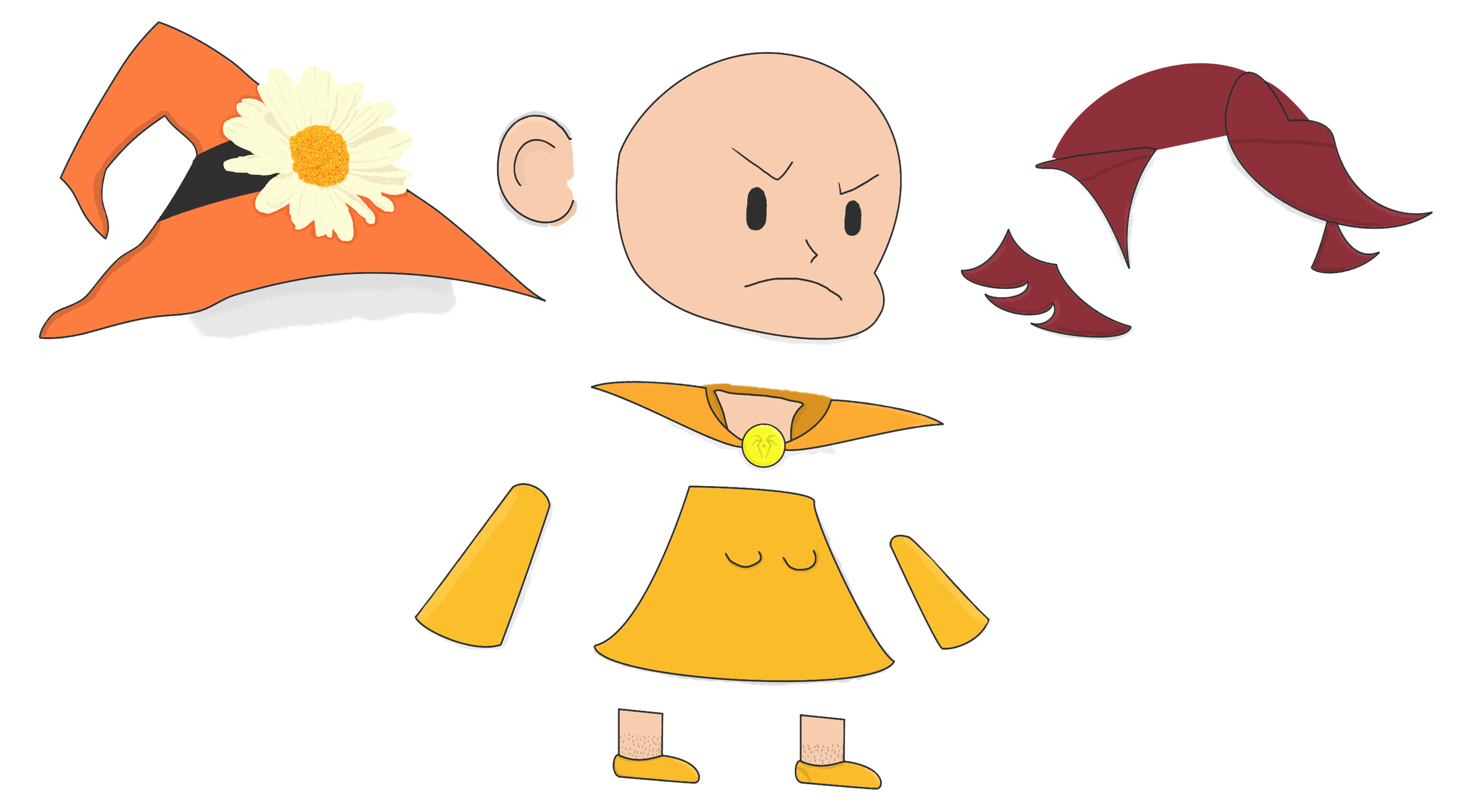
Final Character Design
The final character was drawn in Photoshop with the pen tool at a 3k resolution
#final-character
#final-character-sprite
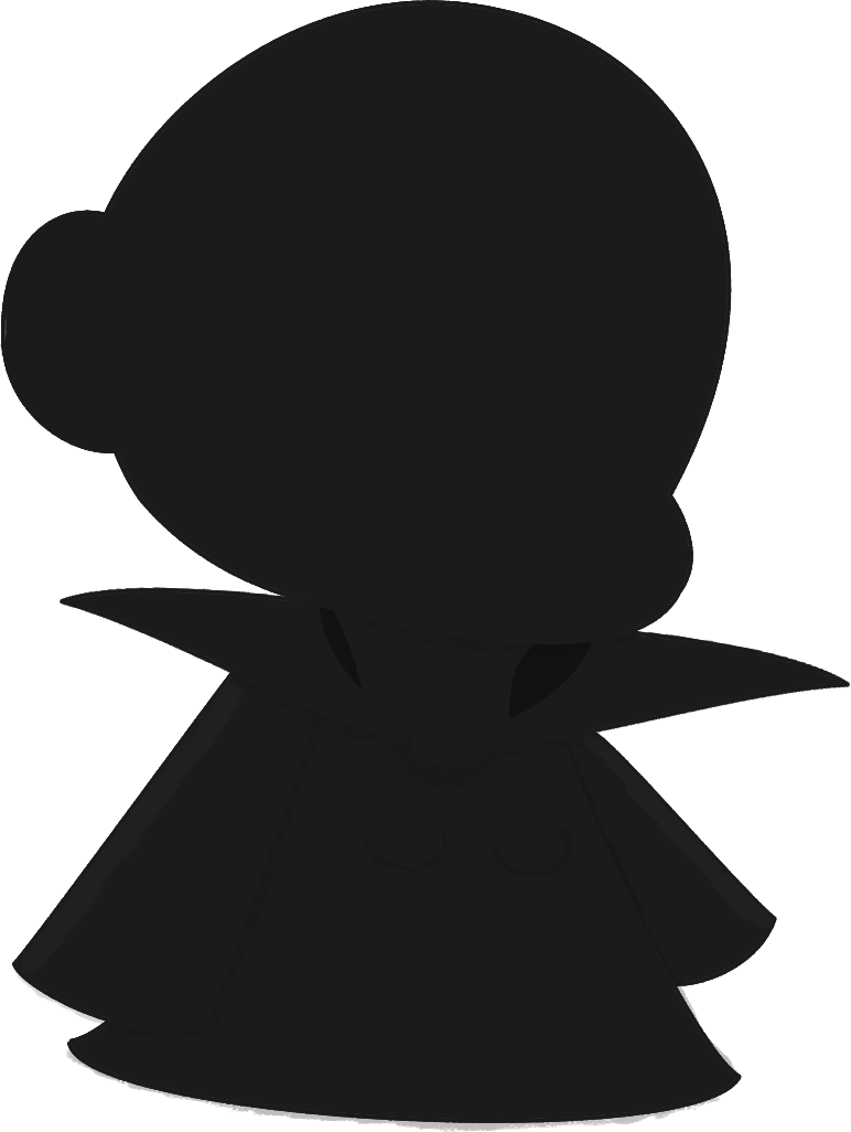
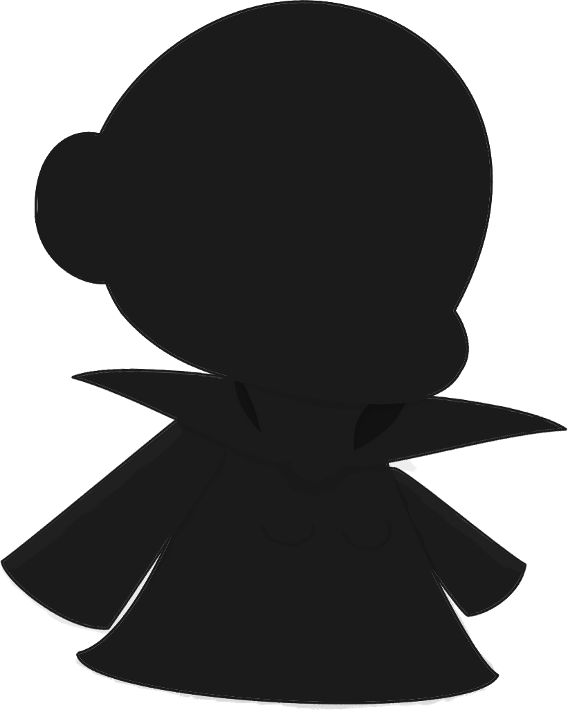
Enemy Design
The enemy was drawn in Photoshop at a 3k resolution.
#enemy-frame-1
#enemy-frame-2

#enemy-frame-3
#enemy-frame-4
#enemy-frame-5

#enemy-frame-6
Enemy & Collectable Animations
Both these animations utalise unity's particle system to give them a more effective and authentic look.
#enemy-animation
#collectable-animation
Acid Mage Trailer
The Acid Mage Trailer is meant to give a short introduction to the Acid Mage gameplay.
#acid-mage-trailer
Desolation Diaries
A collective short film created by the multimedia class of 2020.
#SHORT-FILM #ANIMATION
The Problem
This year we had to literally rethink everything we do as homosapiens, from being together in a classroom to now producing a film from the confines of our own homes/flats. It has been challenging to say the least, but we are now on the precipice of rethinking humanity - and with this project, you as young individual will have the opportunity to tell your COVID-19 story.
The Brief
As a class group each create a unique short film using your preferred media of choice that tells a narrative around the theme of desolation.
The Solution
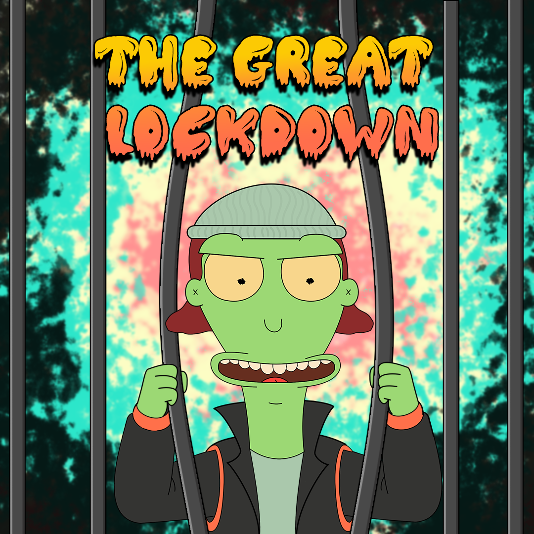
The solution to this film project was a short piece titled The Great Lockdown, which follows the narrative of Lugando. A young man who has just received news of the nation wide Lockdown.
The Intended Audience
The short film is targeted towards a young adult audience as it makes some adult comedic references.
OOF Production House
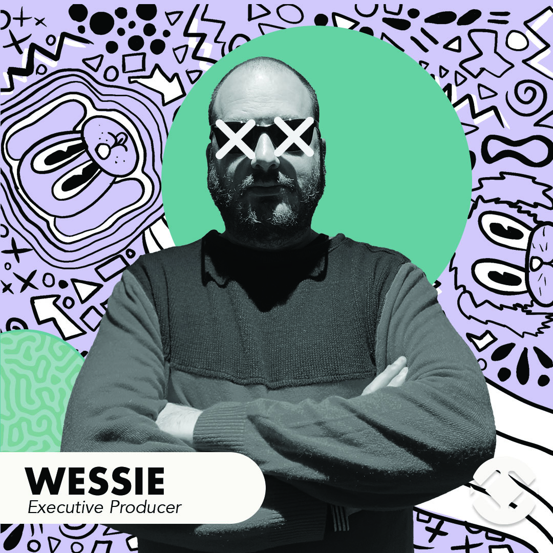
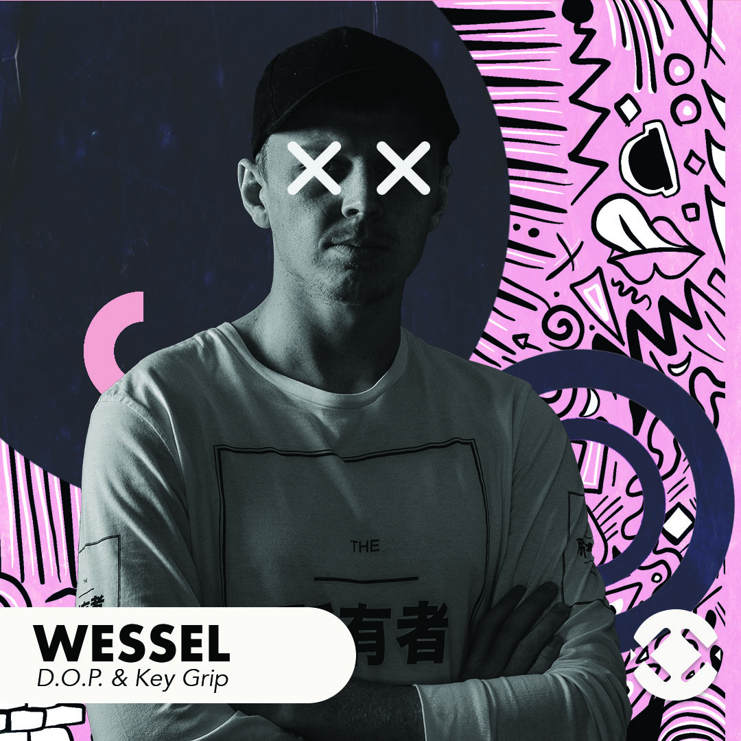
Wessie
Executive Producer / Lecturer
Wessie is the fantastic mind that has lead the multimedia class of 2020.
He has been huge benefit to my personal development as a student and as a creative.
A person who is truly compassionate about his students.
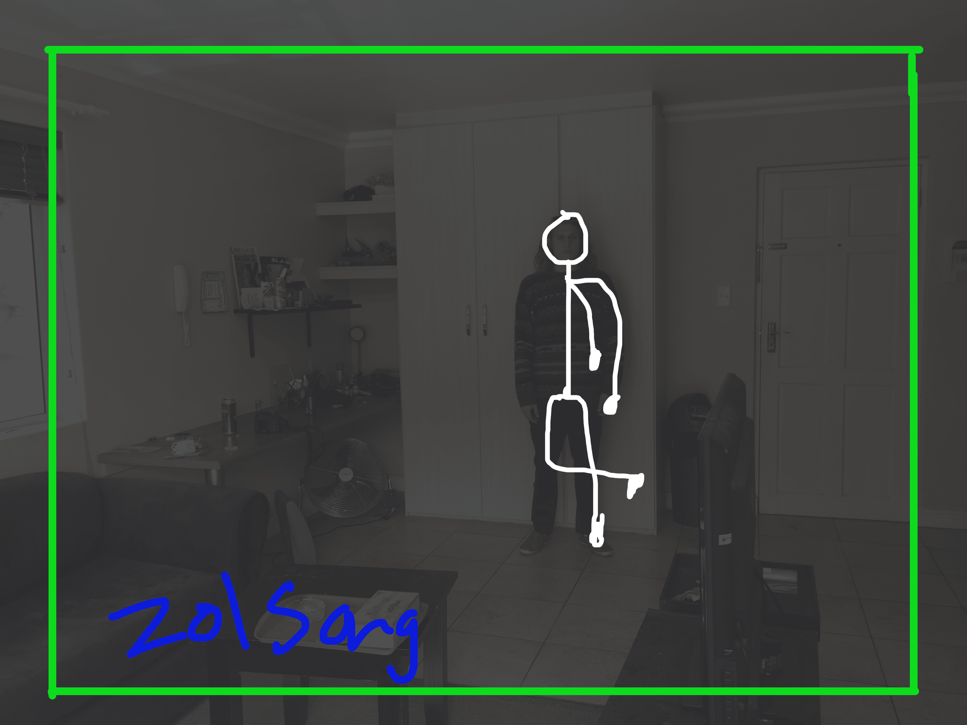
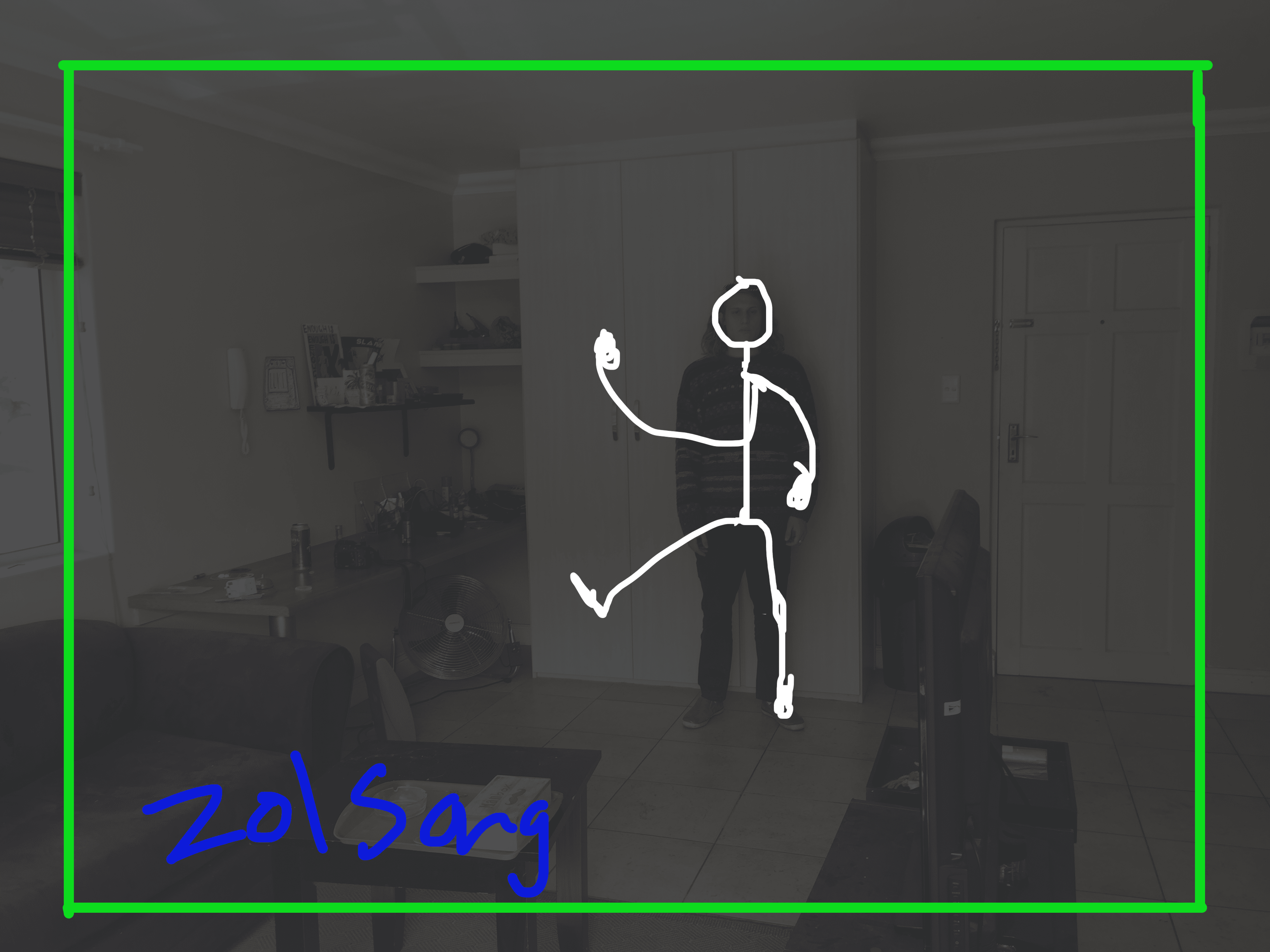
Story Boarding
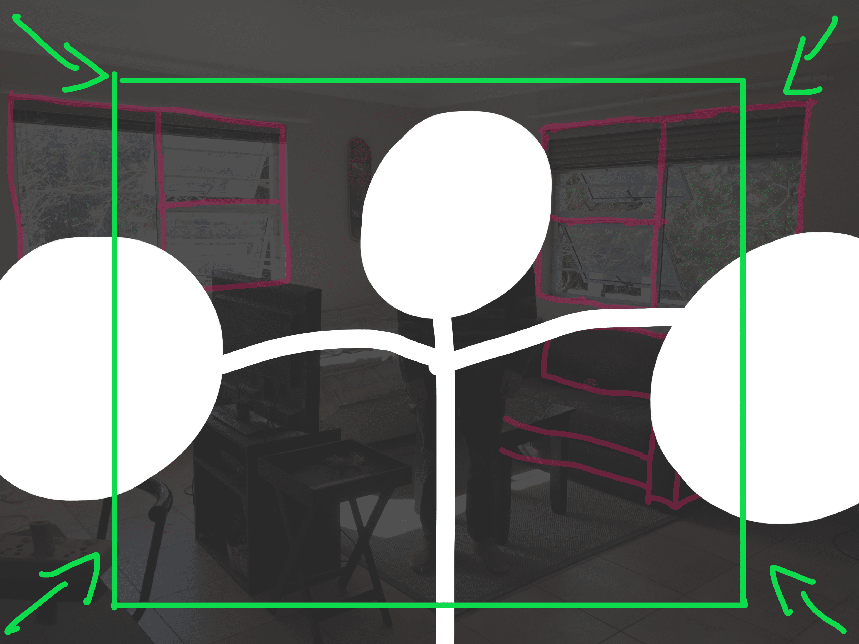
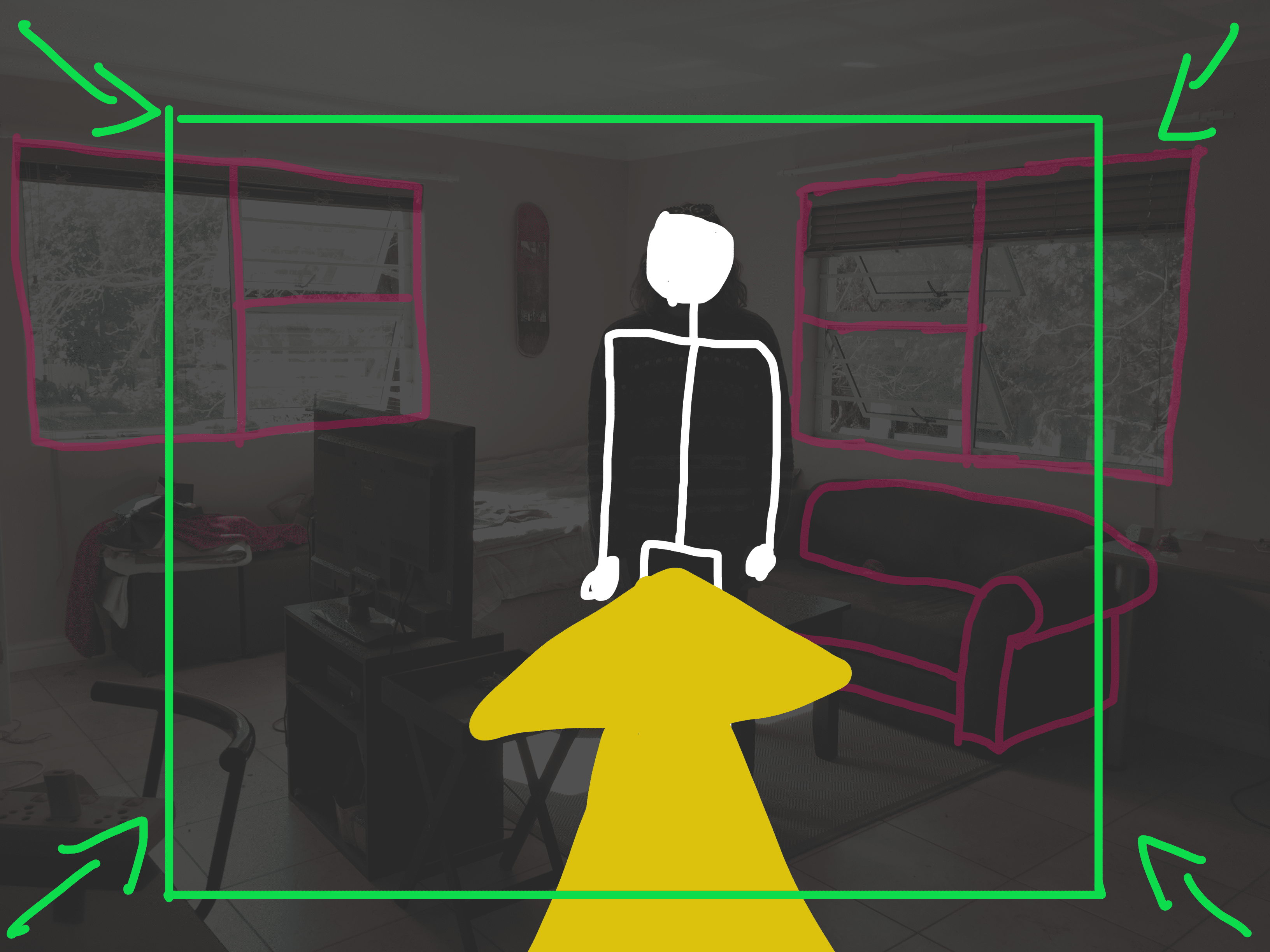
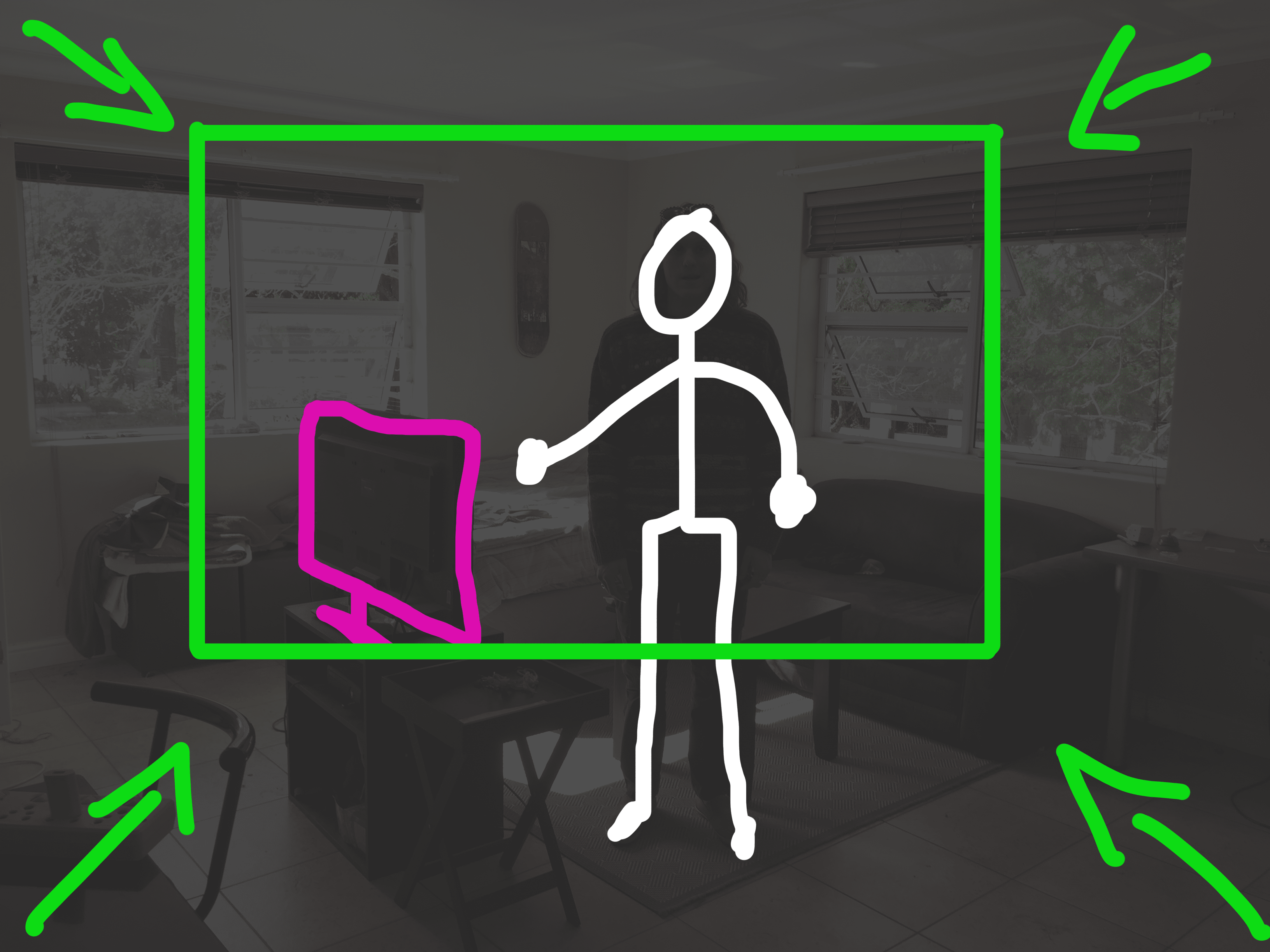
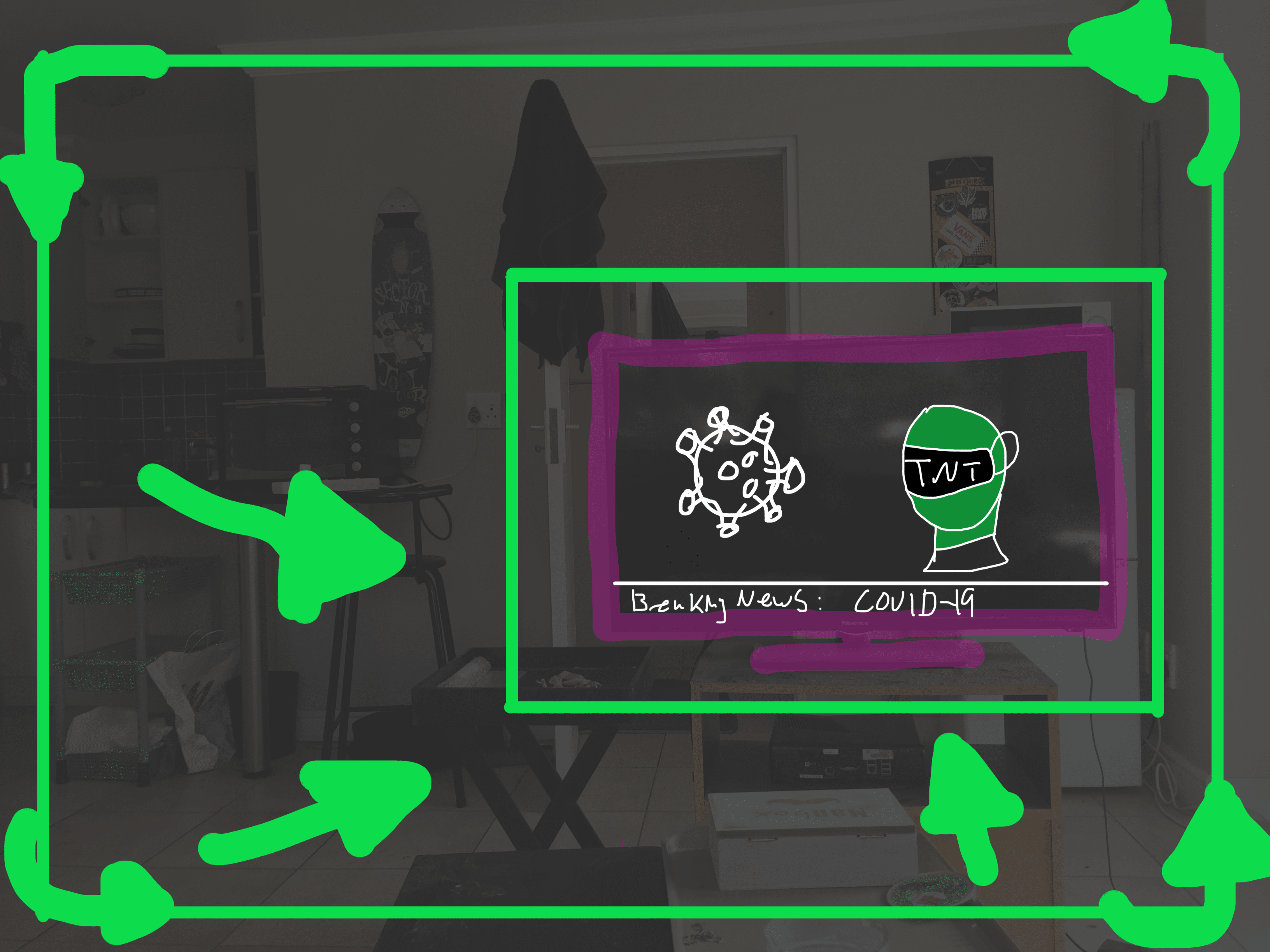
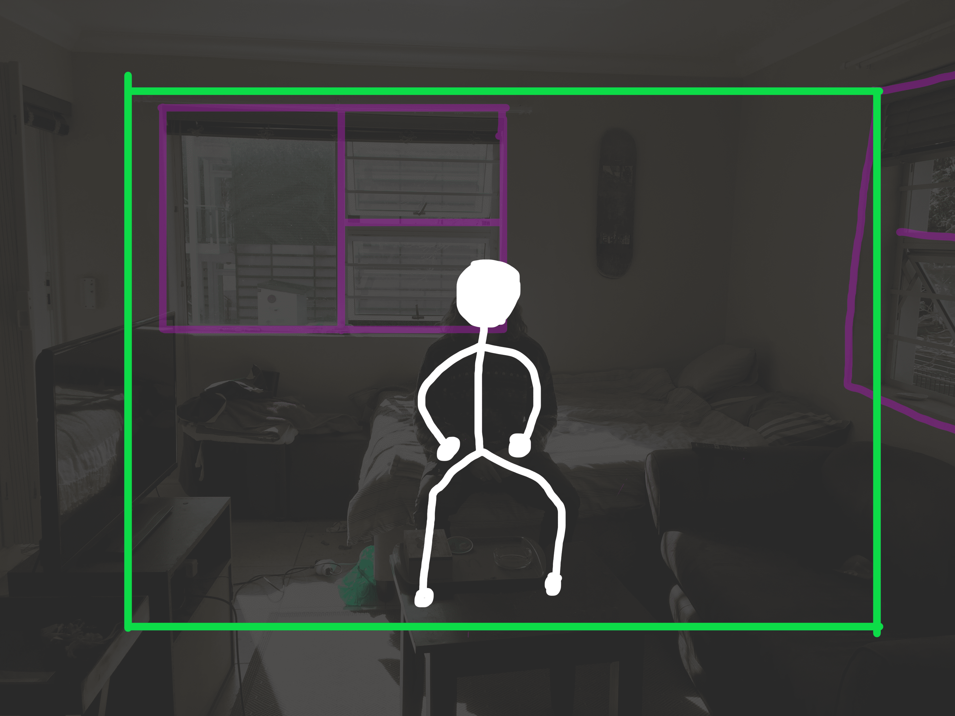
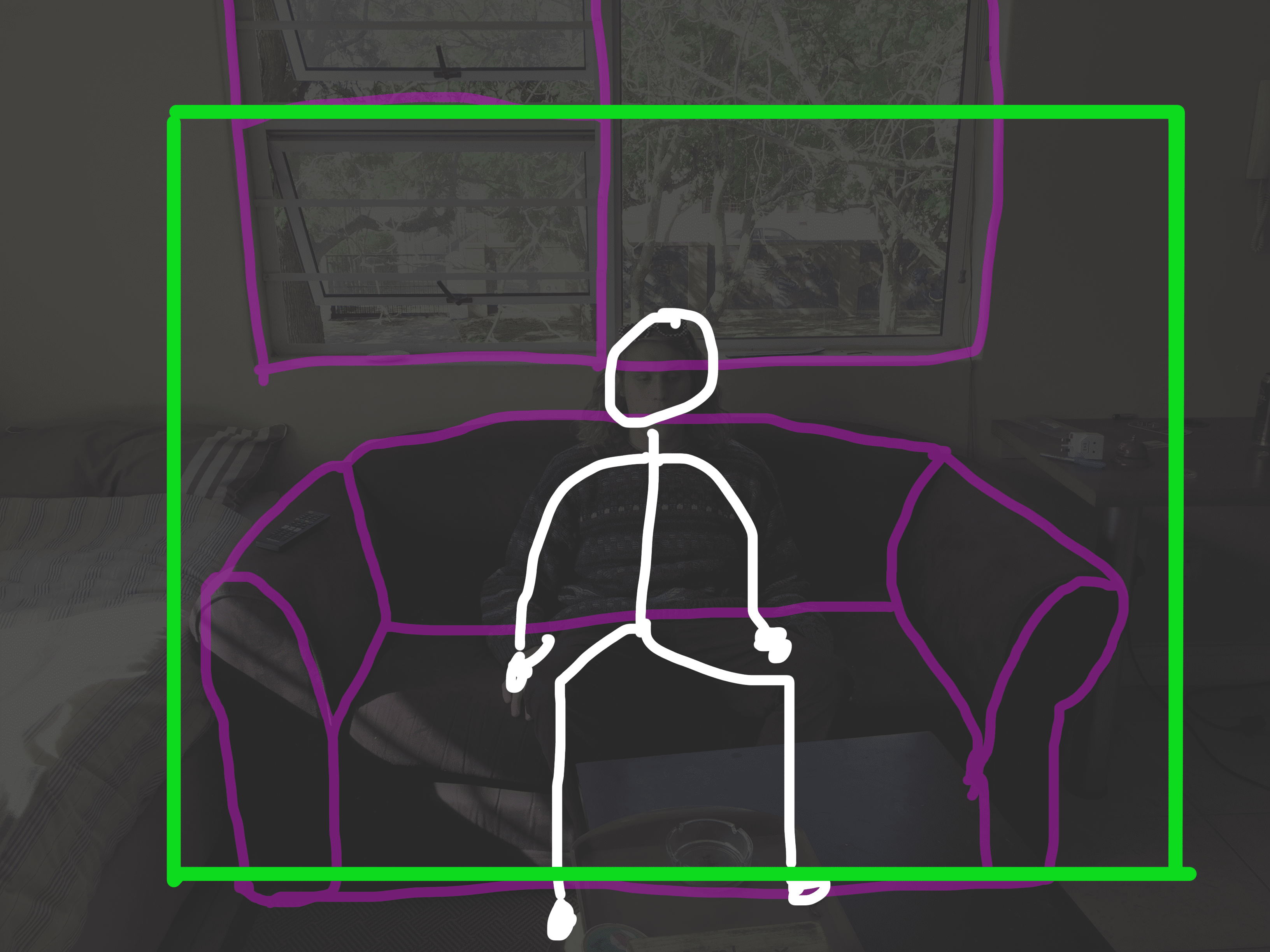
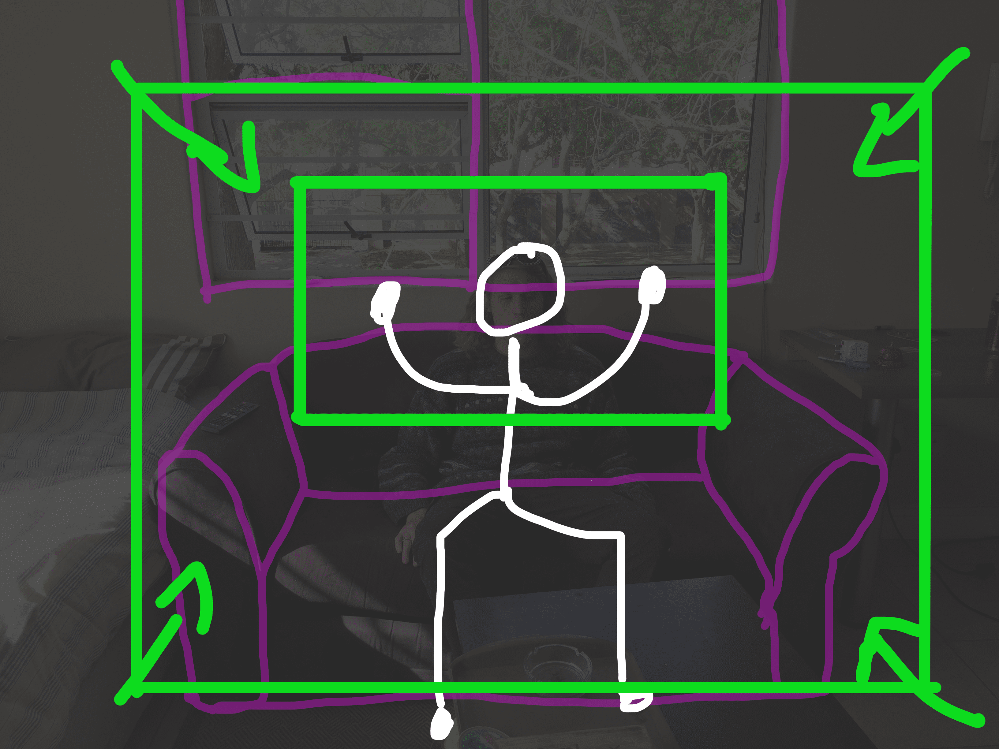
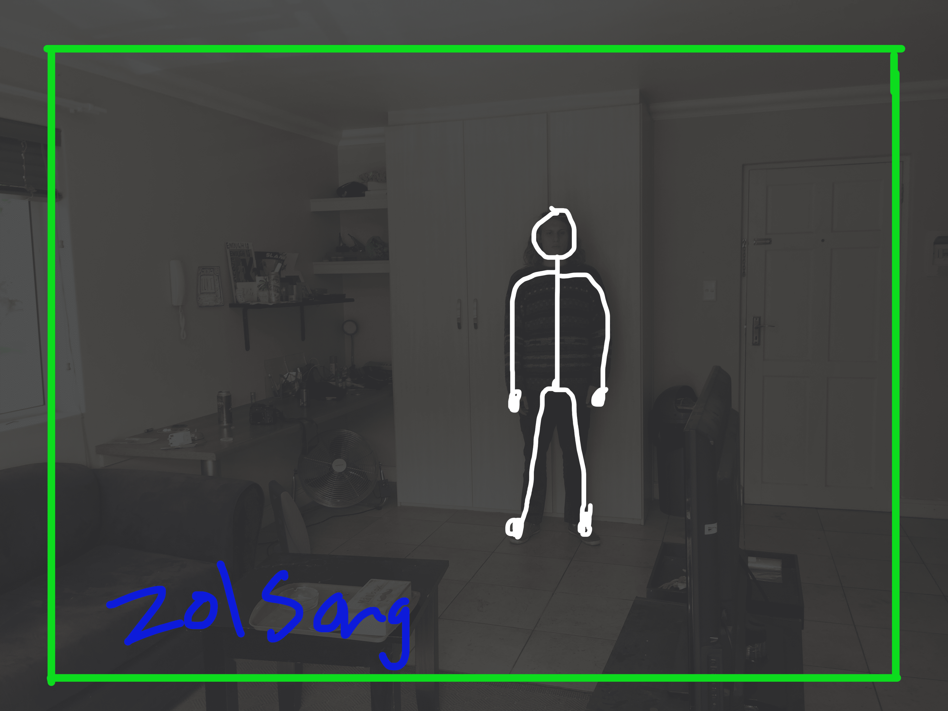
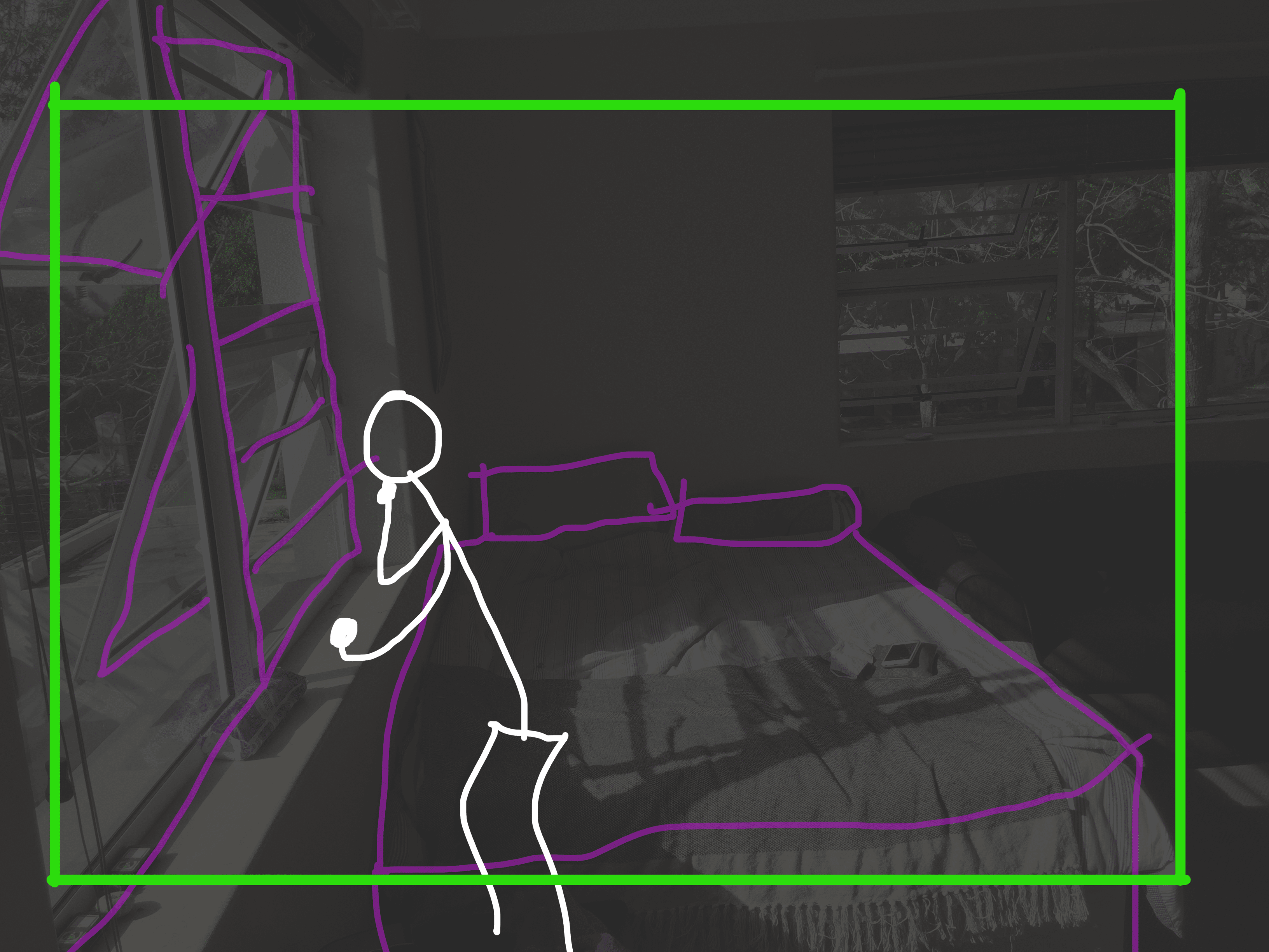
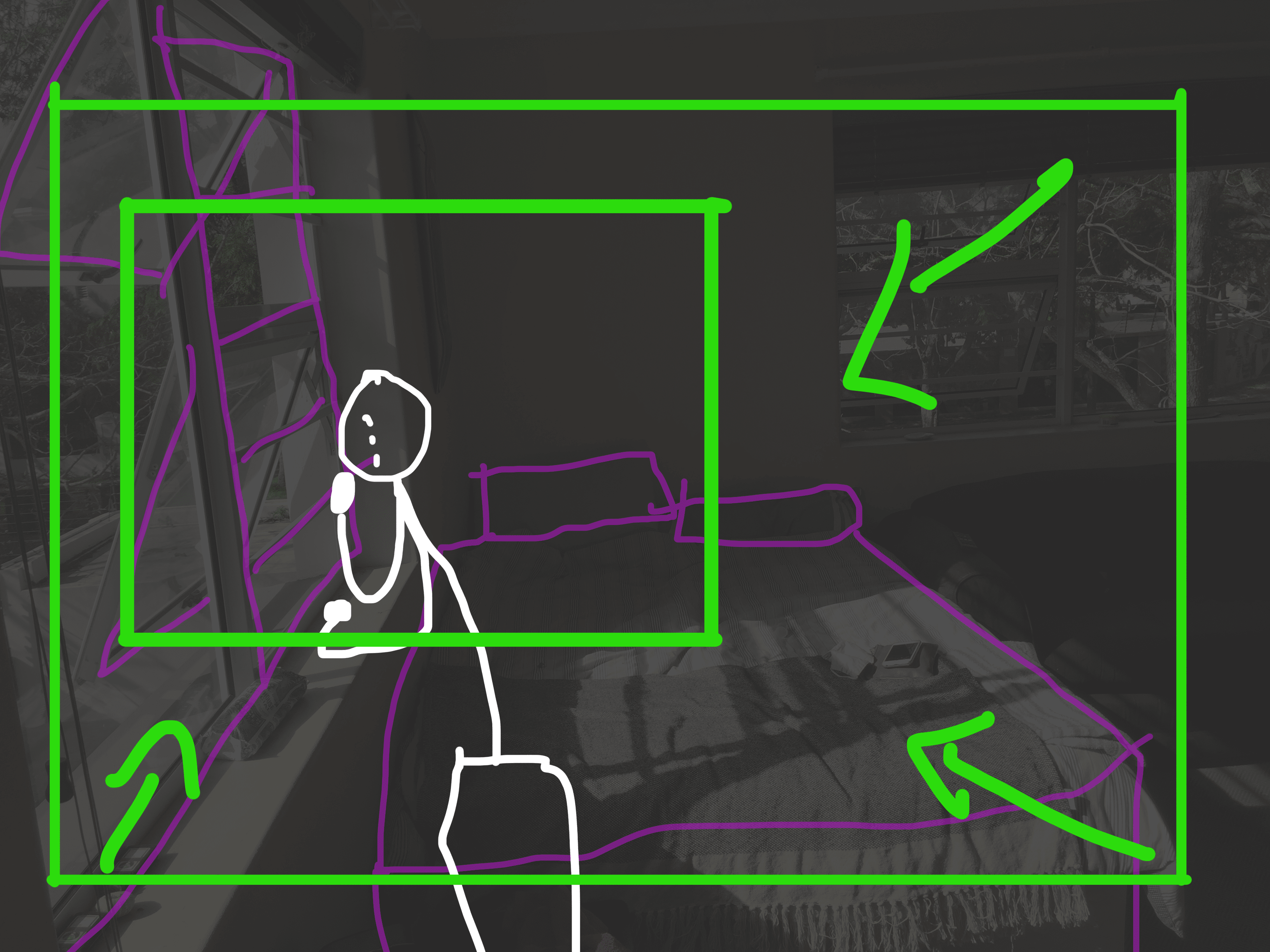
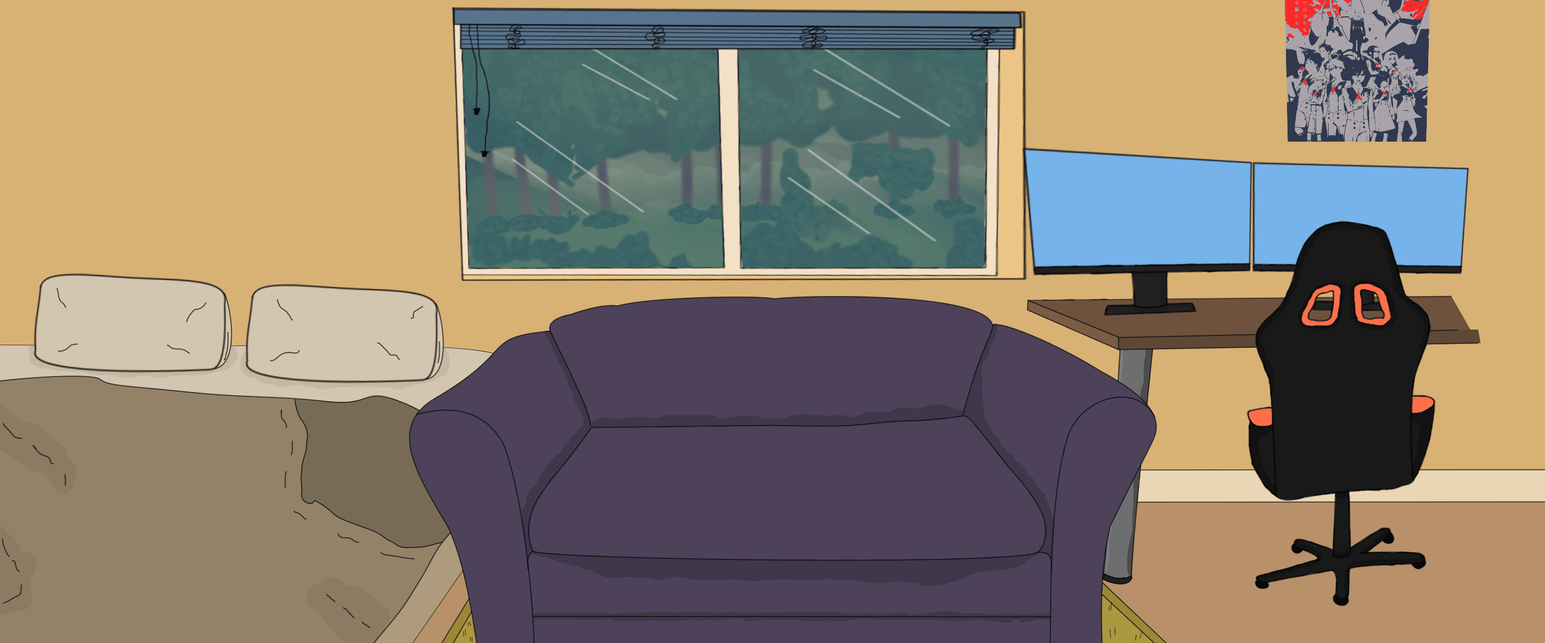
Images for set design
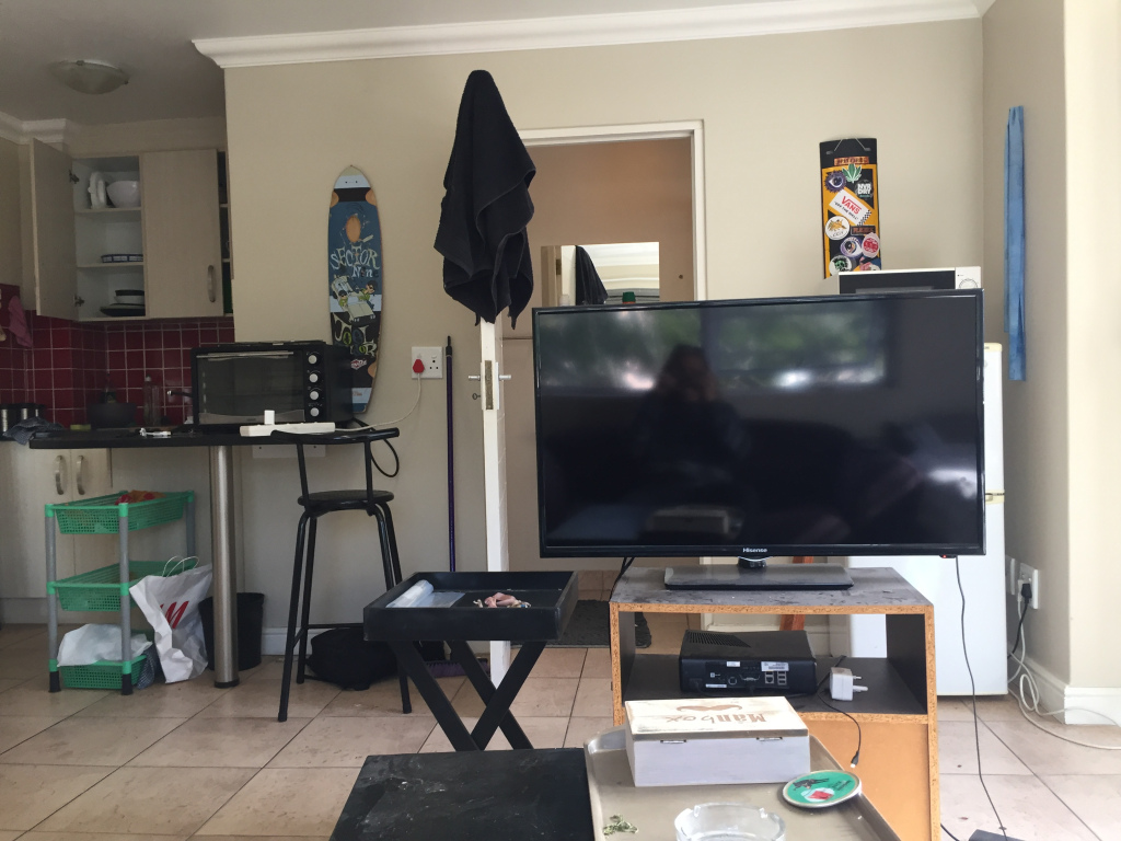
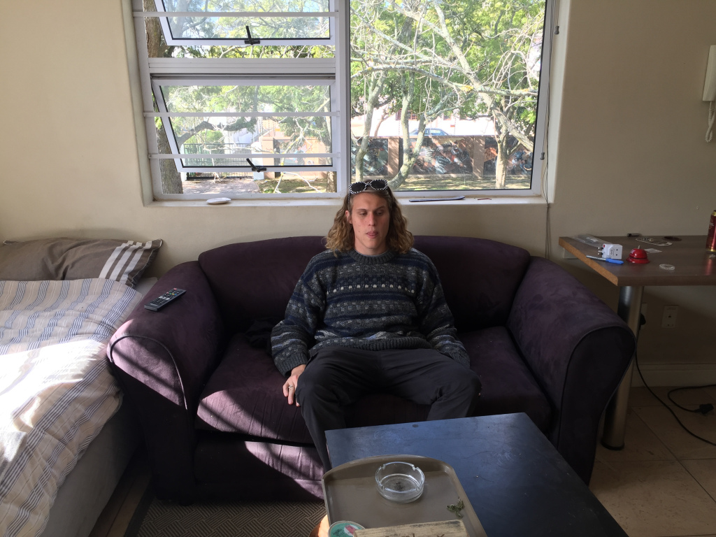
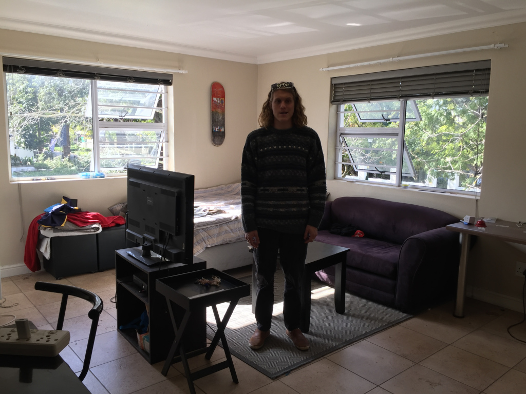
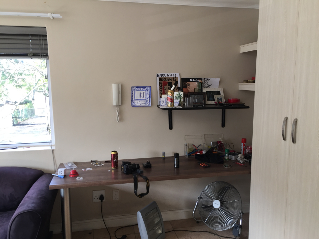
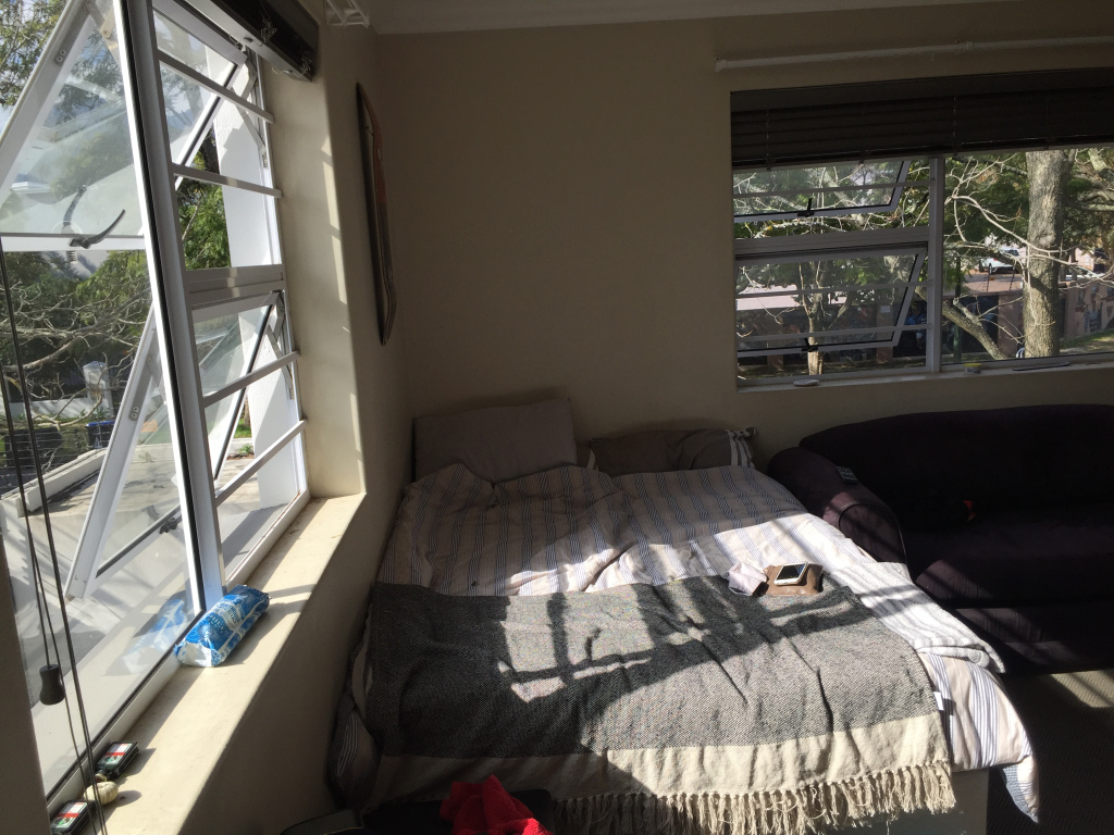
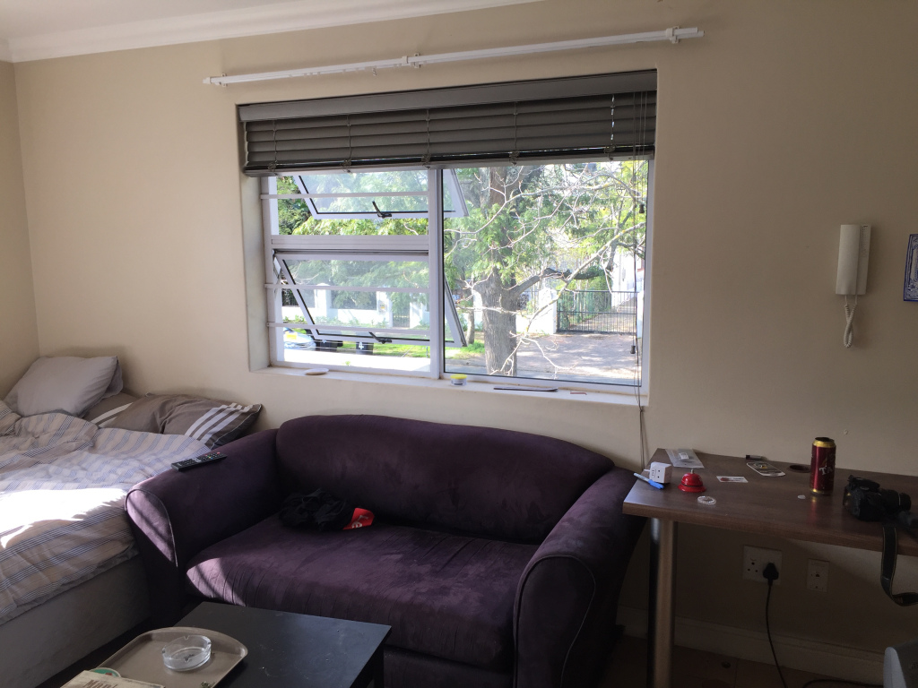
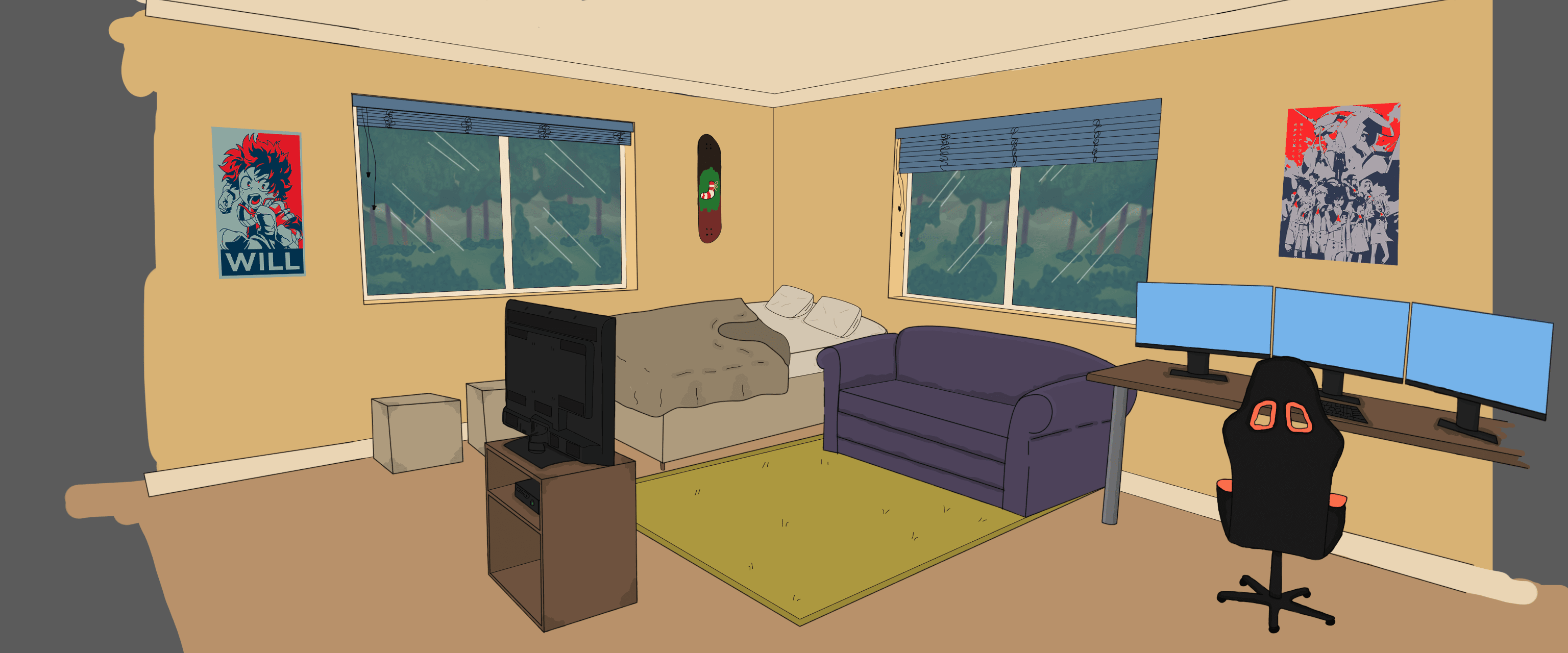
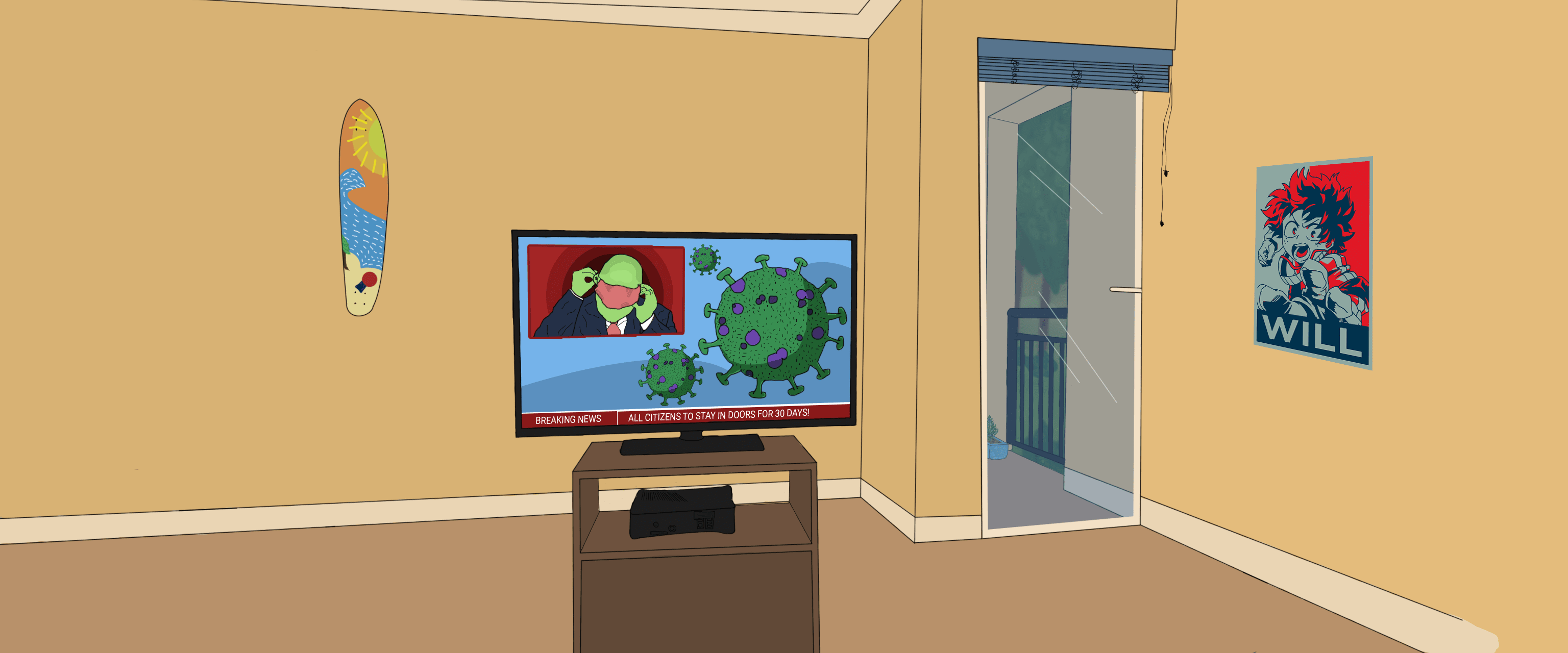
Set Design
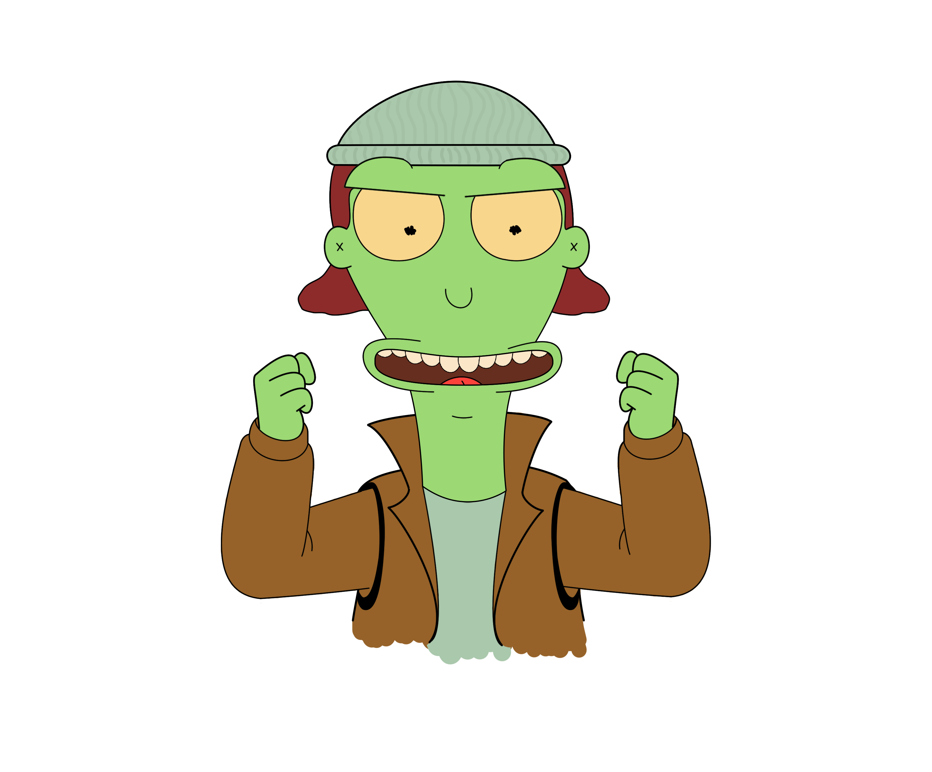
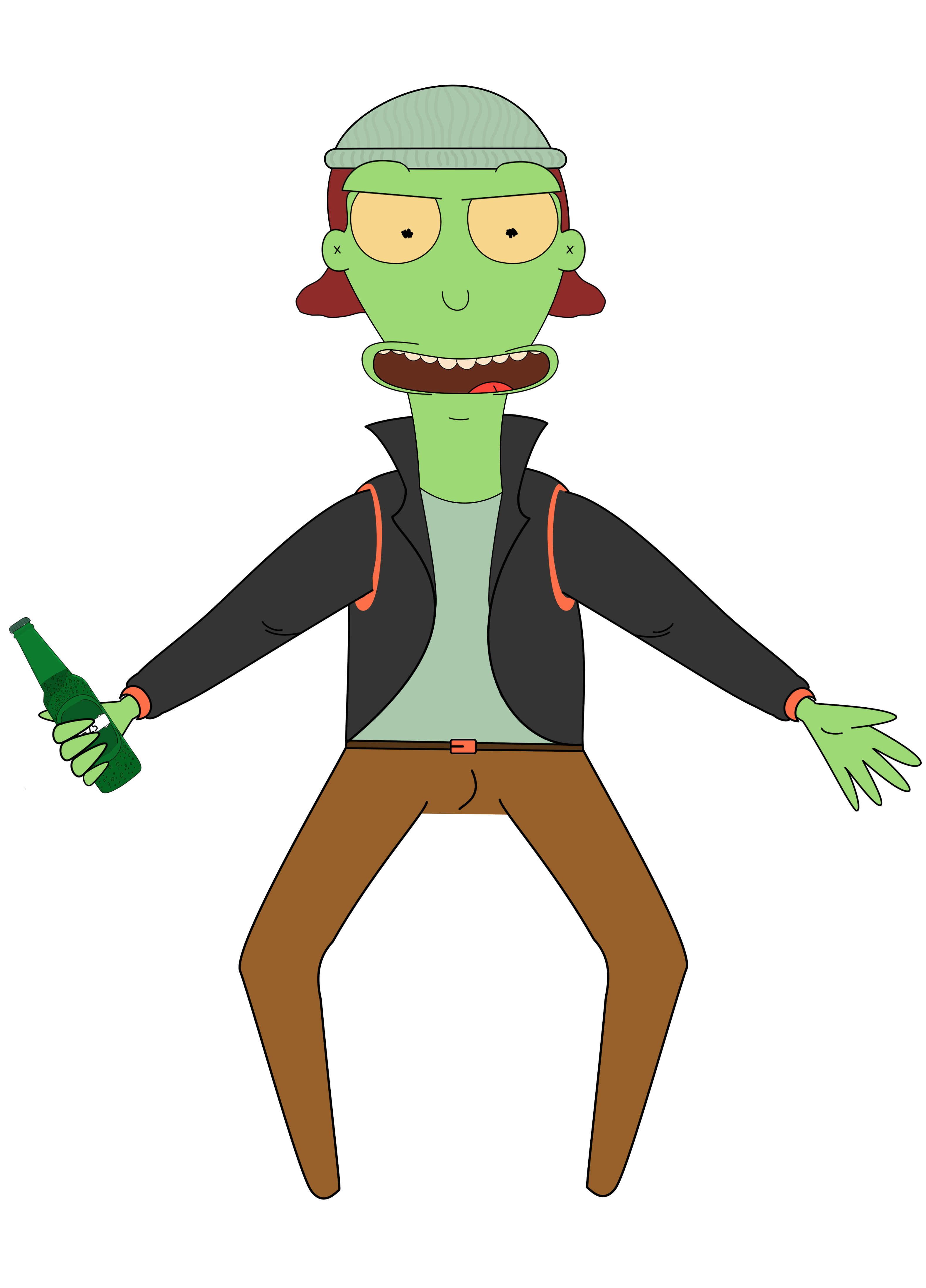
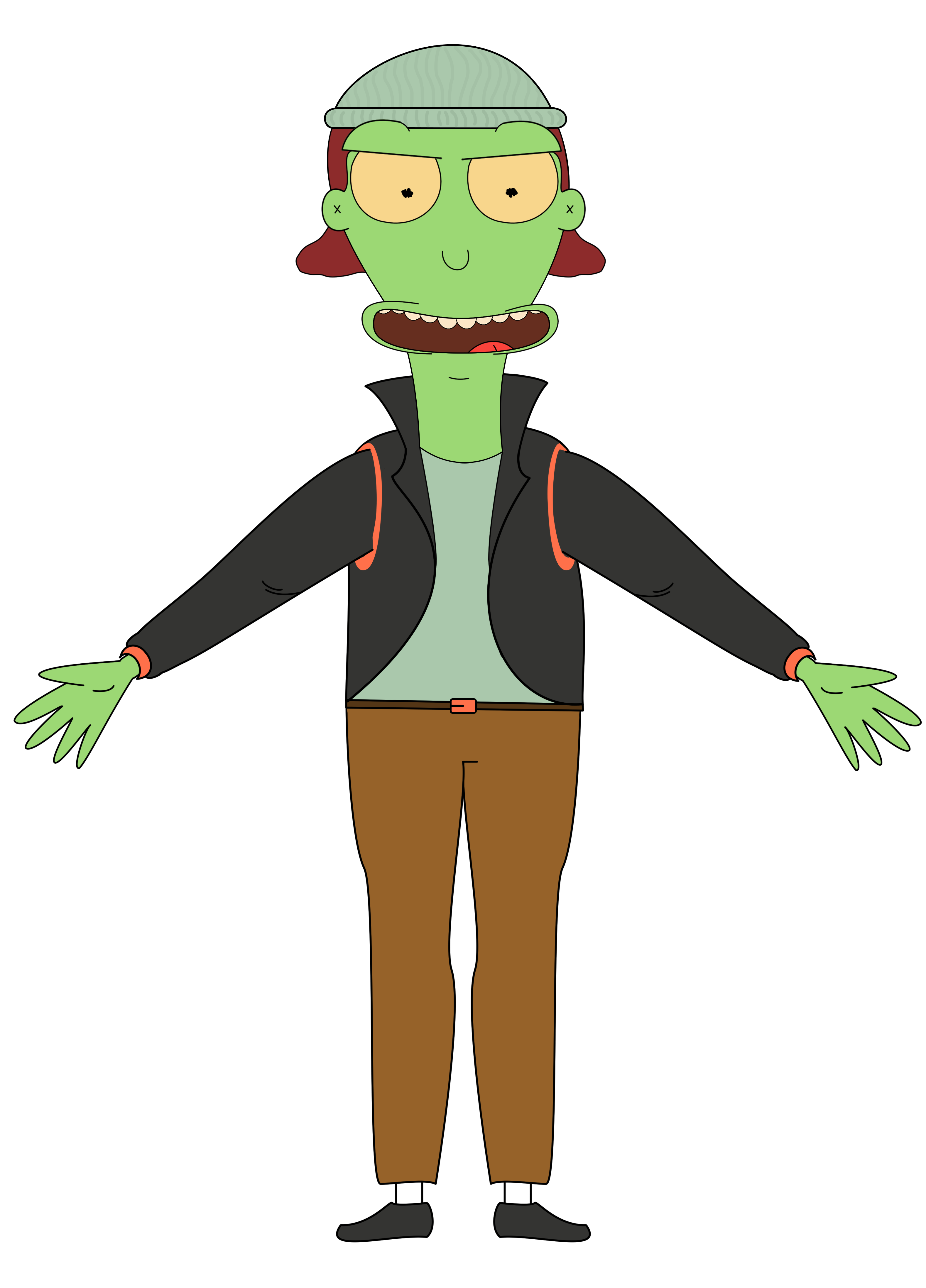
Character Design
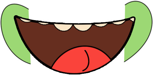
Mouth Design






Cover & Title Screens
Animation Short
Final Film
The Blinki and Sqeeki Show
A 2019 short animation film.
#ANIMATION #SHORT #2019
The Problem
Create a short film based on any narrative and execute this animation in After Effects.
The Brief
Utalise your design application to create characters along with a walk and run cycle while developing a complete storyline.
The Solution
The solution was to create a short comedic film that was based on the auditions to Adventure Time.
Blinki and Sqeeki wake up one morning late for their audition to join the Adventure Time cast, an adventure follows.
The Intended Audience
Young teenagers and fans of Adventure time.
Animations
Walk Cycle
A walk cycle was created for both characters in after effects using the Duik plugin.
Run Cycle
The run cycle followed the same pattern as the walk cycle although with Blinki and his long limbs it was challenging to create a convincing run cycle as a second year student.
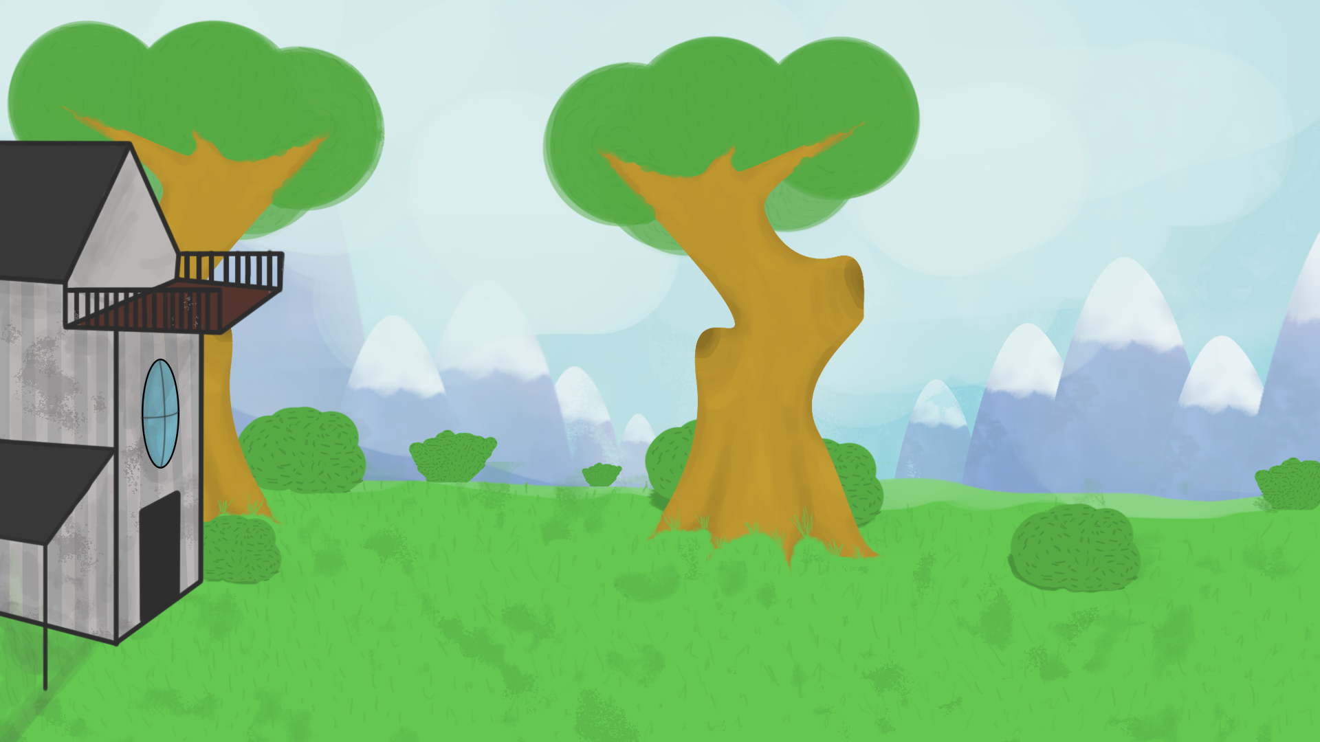
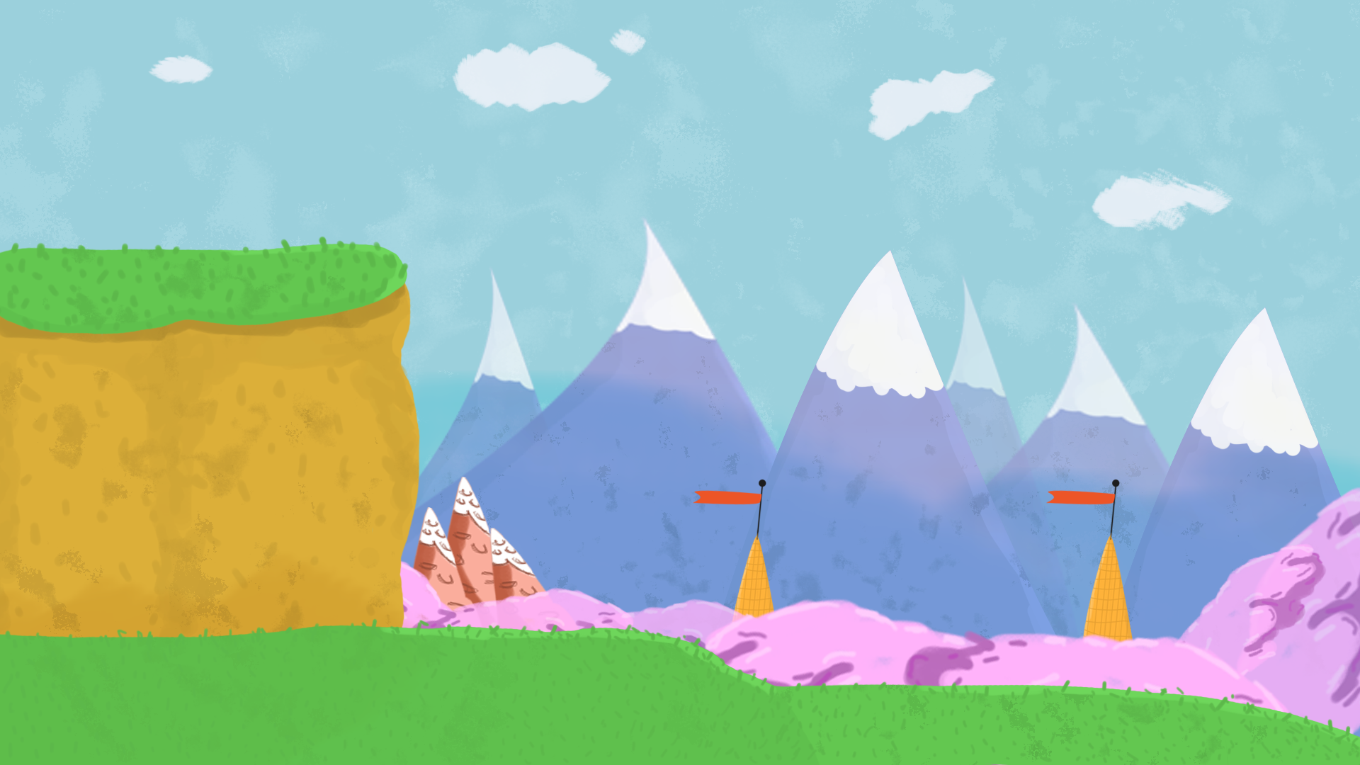
Backgrounds
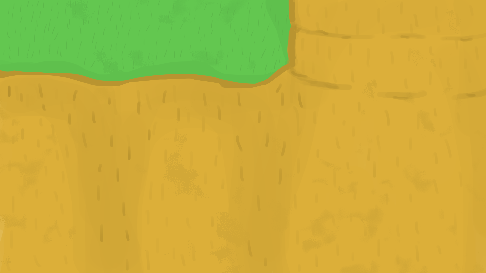
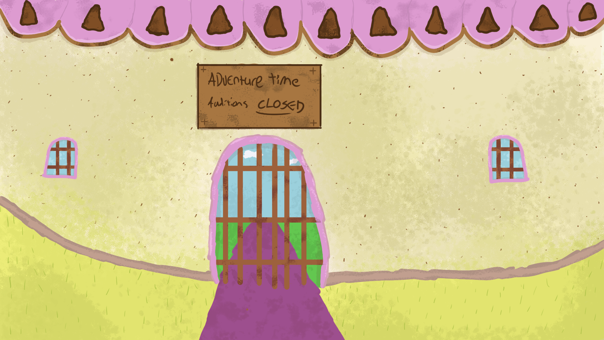
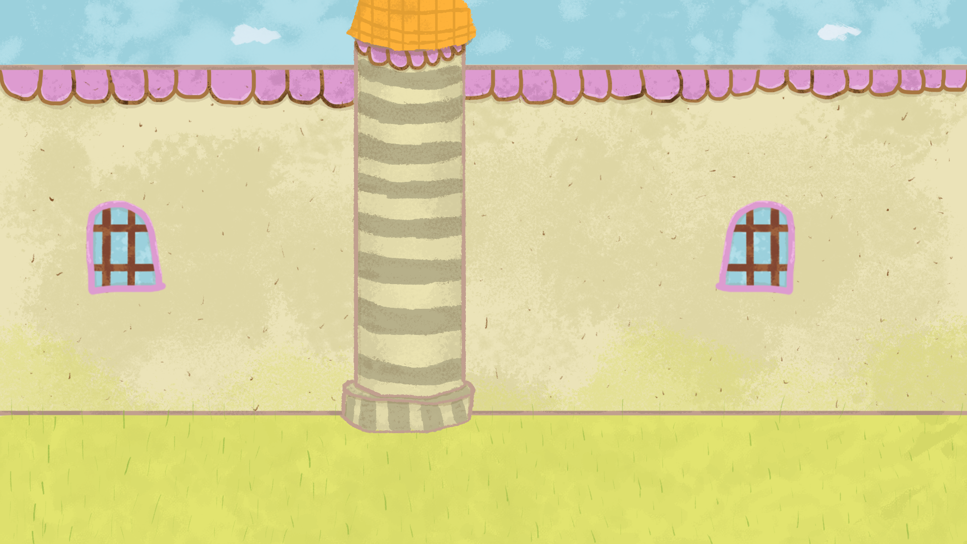
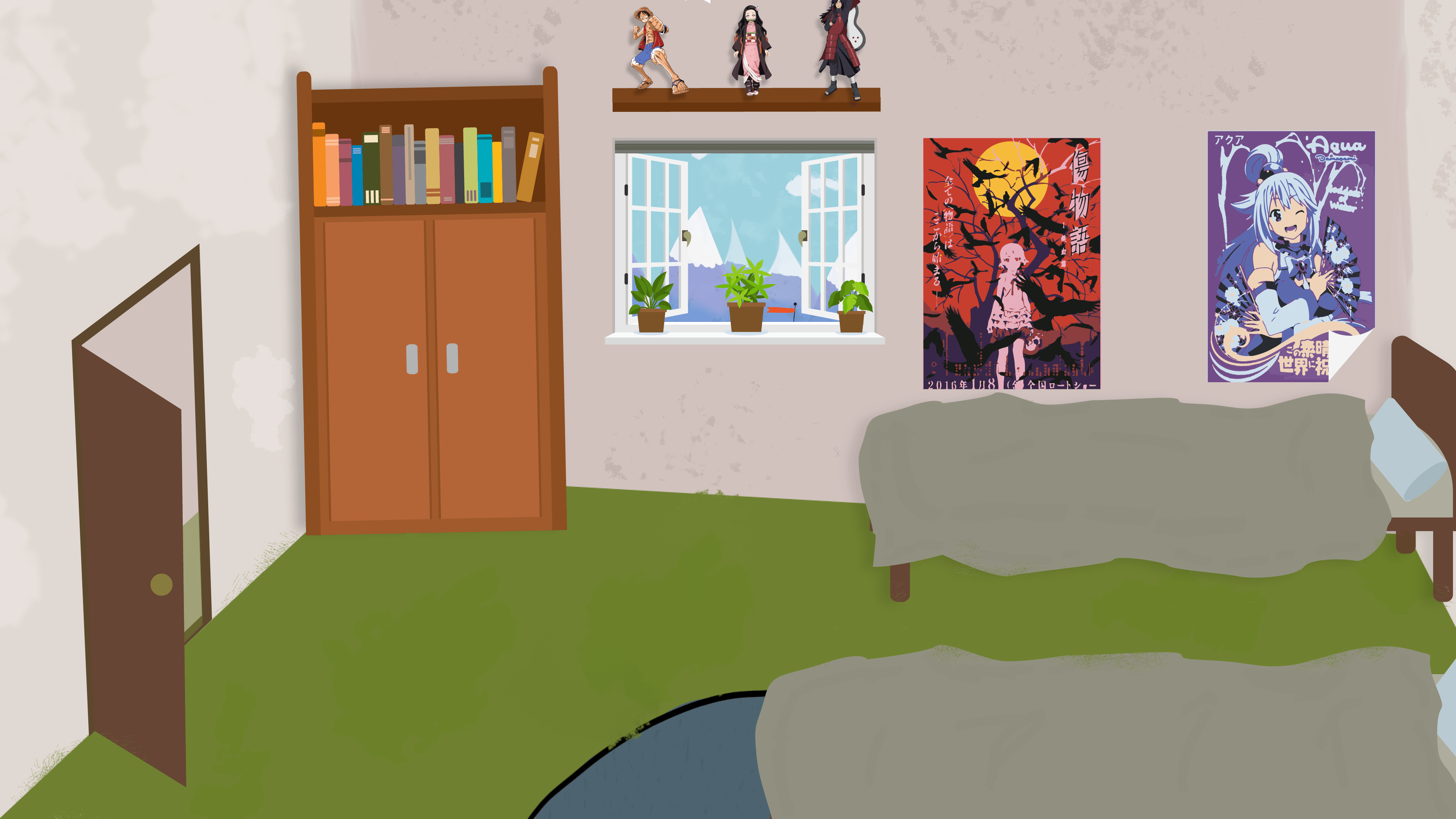
Post Processing
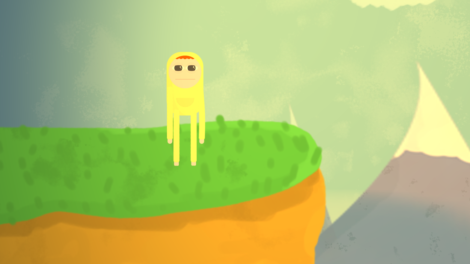
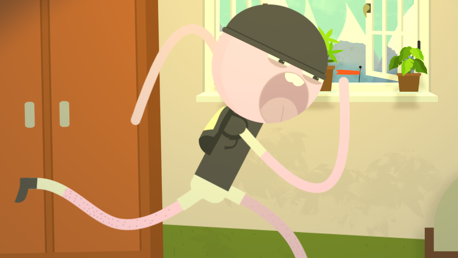
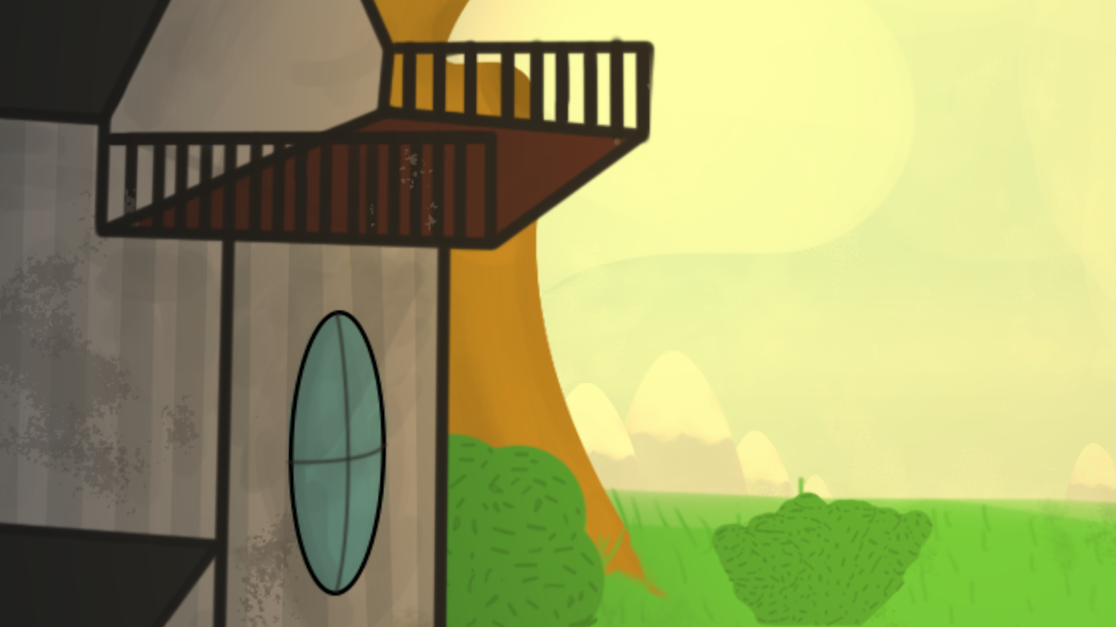
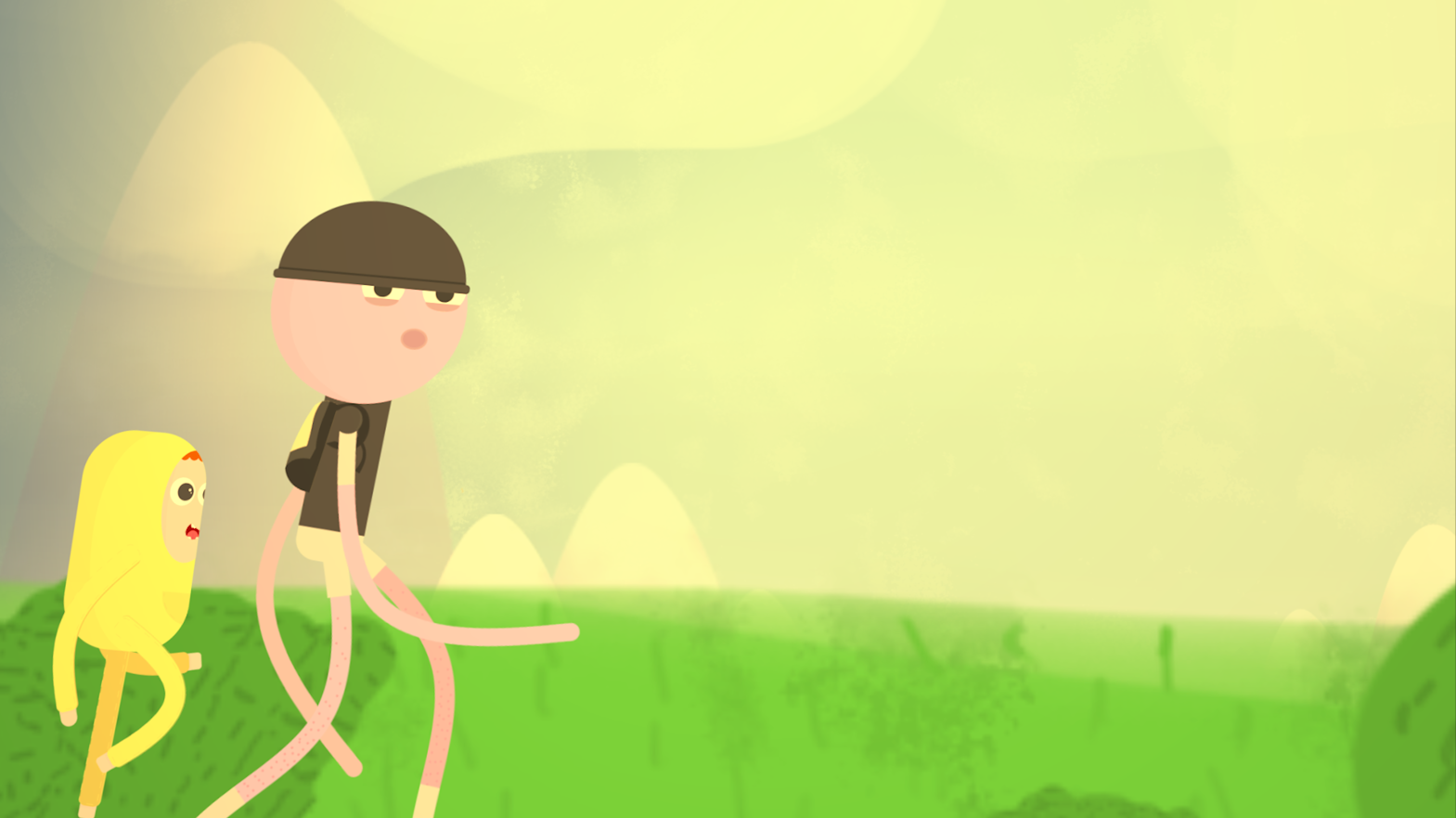
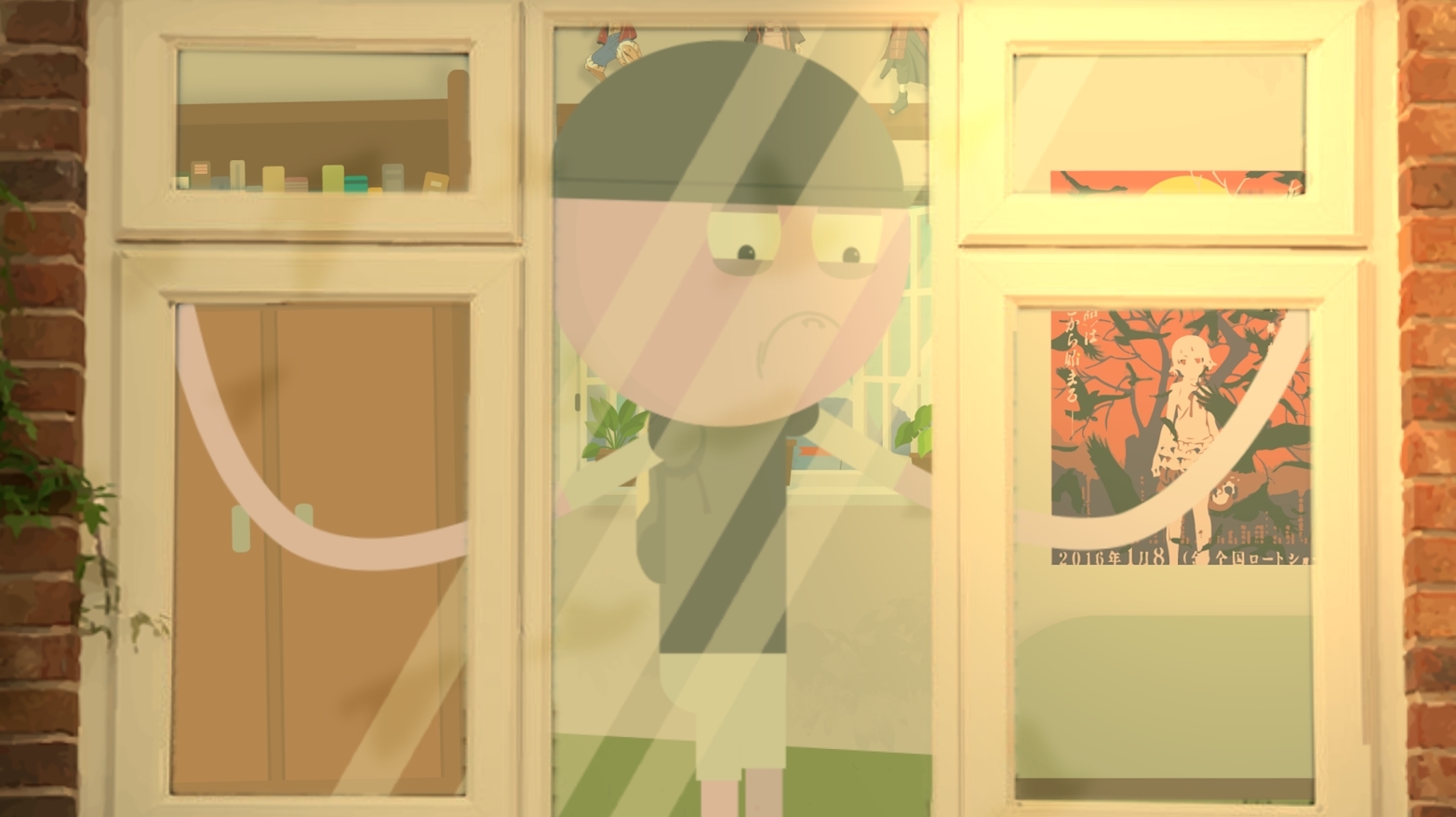
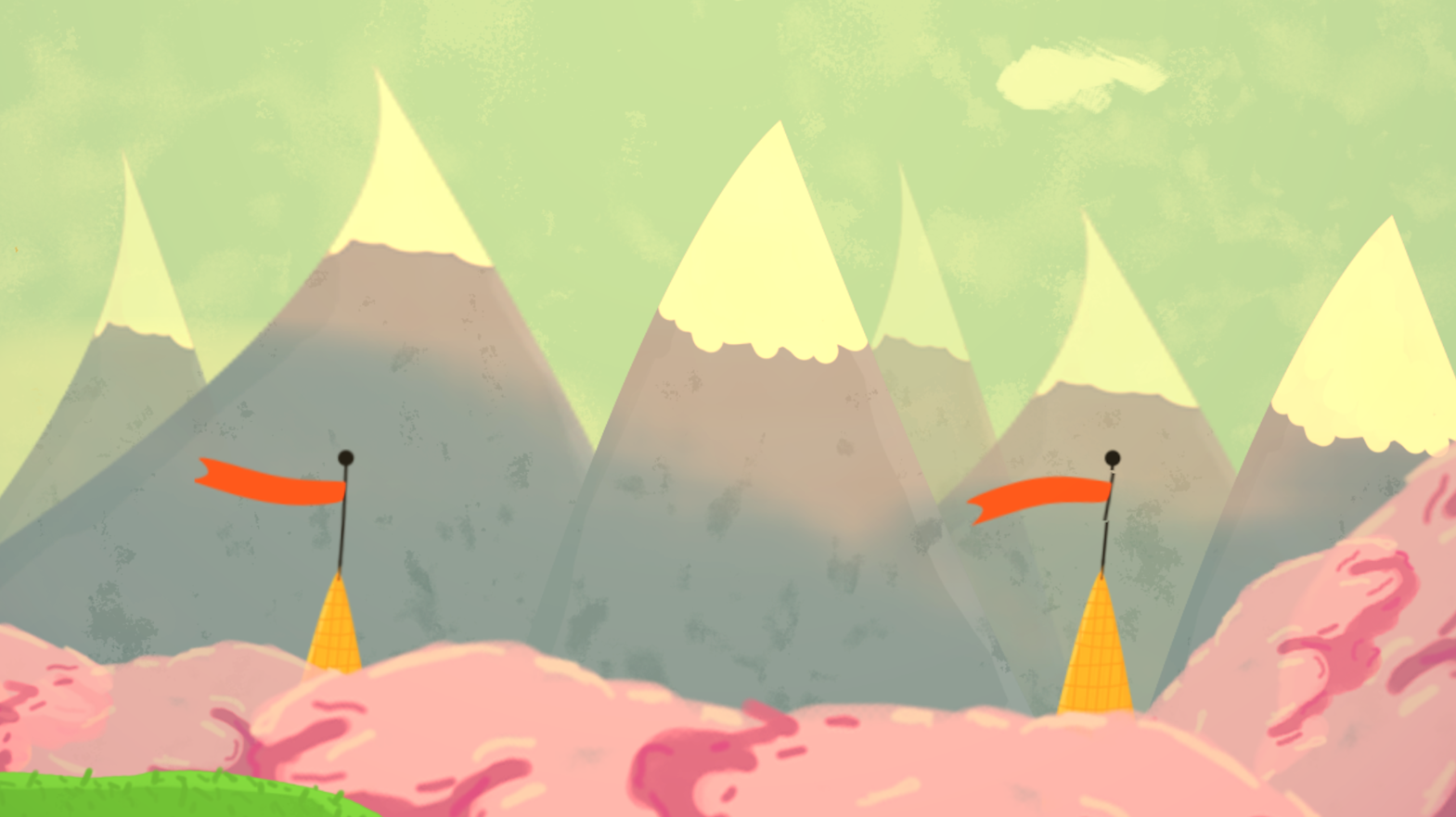
Animation Examples
Final Animation
2020 Show Reel
A collective animation of my 2020 work.
#ANIMATION #SHOWREEL
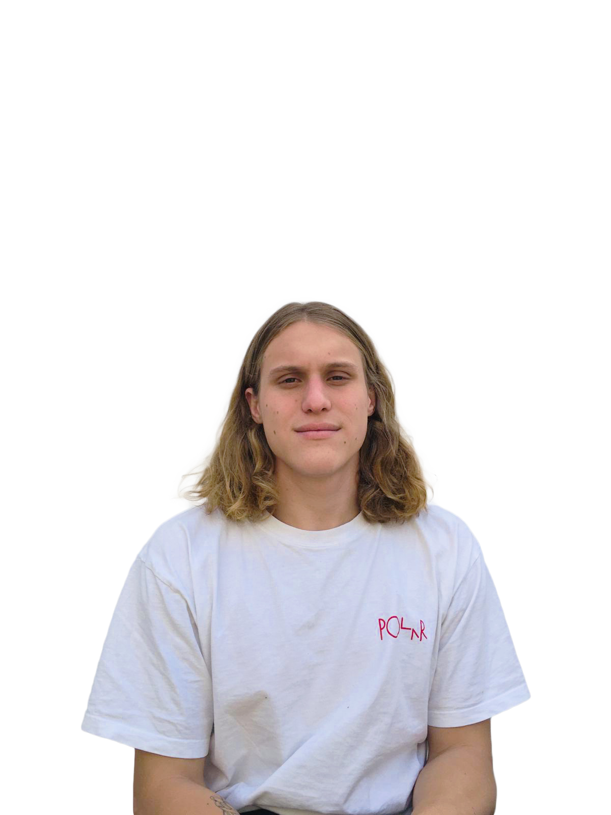
Hi, I am Luke.
My degree at the Stellenbosch Academy of Design and Photography has taught me that I have a strong suit for problem solving and thus have really enjoyed the more complex aspects of our projects such as our large animation briefs as well as web, app and game design projects.
Through work experience and academy projects I was introduced to the topic of user experience. Which for me, is the current career path I am interested in venturing into. The reason being that I have found myself to be infatuated with the idea of understating how people experience the world around them and how we as creatives can better those experiences through problem solving.
Thank you for viewing my portfolio!
If you think I would be a valuable asset to your team, please feel free to contact me.
